Brand guidelines are the written rules for how a brand looks, sounds and behaves, so that anyone who makes something in its name gets it right without asking. To create brand guidelines people actually use, keep them short, show real examples rather than abstract rules, put them where people already work, and give someone the job of keeping them current.
Last updated: 27 October 2026.
This guide covers what brand guidelines are, what to include (with a section-by-section table), how they differ from a style guide and a brand book, the steps to build them, the format to choose, how to keep them in use, colour contrast and accessibility, and the questions buyers ask most.
What are brand guidelines?
Brand guidelines are a reference document that turns a brand identity into instructions. The identity is the set of decisions: the name, the logo, the colours, the type, the voice. The guidelines explain how to apply those decisions on a poster, a website, a social post, a slide or a shop sign, by people who were not in the room when the decisions were made.
That last point is the whole purpose. A designer who built the identity rarely needs the rules. A freelance video editor, a new marketing hire, a printer or a partner brand does. Guidelines are written for them, and the test of good guidelines is whether those people produce work that looks and sounds like the brand on the first attempt.
At Odduel, a creative and technology agency in Barcelona and São Paulo, guidelines are part of every branding project we deliver, because an identity without rules starts to drift the week after handover.
In short: brand guidelines are the instructions that let other people use your identity correctly. They hold the logo, colour, type, imagery and voice rules, with examples. They only work if they are short enough to read, easy to find and kept up to date. Most guidelines fail on use, not on content.
Why do most brand guidelines go unused?
Before writing a page, it helps to know why so many guidelines end up as a file nobody opens. The causes are almost always the same, and each one points to a fix.
- Too long. A hundred pages of principles and mood words hide the five rules that matter. People skim, miss the rule and guess.
- Too abstract. “Our brand is bold yet approachable” tells a designer nothing. A do and don’t pair beside a real layout tells them everything.
- Hard to find. A PDF attached to an email two years ago is not a reference. If people cannot reach it in ten seconds, they will not.
- Out of date. Once the guidelines show an old logo or a retired colour, people stop trusting the rest of the document.
- No owner. Without a named person who answers questions and approves exceptions, every team invents its own version.
The rest of this guide is built around avoiding those five failures.
What should brand guidelines include?
The content depends on the size of the brand, but most guidelines need the same core sections. The table sets out what each one holds and who reaches for it. Use it as a brand guidelines template: start with the core sections and add the rest only when someone actually needs them.
| Section | What it holds | Who uses it |
|---|---|---|
| Brand foundations | Purpose, positioning, audience, values in a few lines | Leadership, marketing, agencies, new hires |
| Logo | Versions, construction, clear space, minimum size, misuse examples | Designers, printers, partners, developers |
| Colour | Palette with HEX, RGB, CMYK and spot values, proportions, contrast pairs | Designers, developers, printers |
| Typography | Typefaces, weights, sizes, hierarchy, fallbacks for web and office tools | Designers, developers, anyone making slides |
| Imagery | Photography and illustration style, crops, what to avoid | Photographers, content creators, social teams |
| Voice and tone | How the brand writes, words it uses and avoids, examples | Copywriters, social teams, customer service |
| Layout and graphic elements | Grids, patterns, icons, recurring devices | Designers, motion designers |
| Applications | Real examples: social posts, web pages, packaging, signage, slides | Everyone, as the quickest way to understand the rules |
| Files and contacts | Where the master files live and who approves exceptions | Everyone outside the core team |
The core every brand needs
A small brand can start with logo, colour, typography, a short voice section and three or four applications. That is often enough to keep every new piece consistent. Foundations can be a single paragraph: the guidelines are a working tool, and the strategy document can live elsewhere.
What larger brands add
Brands with many channels or many makers add motion rules, sound, photography briefs, co-branding with partners, templates for presentations and documents, and a section on digital components shared with the website. Each addition should answer a question people are already asking, not one somebody imagines they might.
Brand guidelines, style guide or brand book: what is the difference?
These three names are often used for the same thing, and in daily use that is fine. When a buyer is comparing proposals, though, the difference matters, because one supplier’s “brand book” may be a short inspiration piece and another’s a full rulebook.
| Brand guidelines | Brand style guide | Brand book | |
|---|---|---|---|
| Main purpose | Rules for applying the whole identity | Visual and written style details | The story and spirit of the brand |
| Typical content | Logo, colour, type, imagery, voice, applications | Colour, type, spacing, sometimes editorial style | Purpose, values, manifesto, mood, key visuals |
| Main readers | Anyone producing work for the brand | Designers, developers, writers | Staff, partners, investors |
| Tone | Practical, with examples | Detailed and technical | Inspiring and narrative |
| How often it changes | When the identity or channels change | Often, with the product or site | Rarely |
In practice, many brands combine them: a short opening that carries the spirit (the brand book part), followed by the practical rules (the guidelines and style guide). If your brand has a written manifesto, it belongs at the front; our guide to writing a brand manifesto explains how that piece is made.
When you ask for quotes, name the sections you expect rather than the label. Two proposals that both say “brand book” can differ by most of the work, which is also one of the main things that moves what branding costs.
How do you create brand guidelines, step by step?
Guidelines are the last stage of identity work, but the thinking behind them starts earlier. These are the steps we follow.
- Settle the identity first. Guidelines describe decisions; they cannot make them. Logo, palette, type and voice must be approved before writing starts, or the document will be rewritten twice.
- List who will use it. Write down the real people and suppliers: in-house designers, a social media freelancer, the web developer, a printer. Their questions decide the sections.
- Collect the hard cases. Look at where the brand has already gone wrong: a stretched logo, an off-brand colour, a caption in the wrong tone. Each becomes a rule with an example.
- Write each rule once, with a picture. One rule, one sentence, one visual. A do and don’t pair beside each important rule is worth more than a paragraph of explanation.
- Show the identity at work. Add finished applications: a post, a web page, a sign, a slide. People copy examples far more readily than they follow instructions.
- Package the files. Logos in every needed format, colour values in a form developers can paste, fonts with their licences, templates. The guidelines point to them; the files do the work.
- Test it on someone new. Hand the draft to a person who has never worked on the brand and ask them to make something. Every question they ask marks a gap.
- Name an owner and publish. Decide who keeps it current and answers questions, then put it where people will find it, and say so in every brief.
Which format works best: PDF or a living web guide?
The format decides whether the guidelines are used as much as the content does. The two common options suit different brands.
| PDF guide | Living web guide | |
|---|---|---|
| Best for | Smaller brands, stable identities, print-heavy work | Brands with digital products, many makers or frequent change |
| Updating | A new version must be sent around | Changes are live for everyone at once |
| Version risk | Old copies keep circulating | One address, always current |
| Files and code | Linked or packed separately | Downloads and code values on the same page |
| Effort to set up | Lower | Higher, and someone must maintain it |
A good middle path is a well-designed PDF kept at one permanent address, with a version number and date on the cover, plus a shared folder of master files. Brands with a website or app built on a design system usually move to a web guide, so that colour tokens, type scales and components in the guidelines match the code.
Social media needs its own pages
Social channels change fastest and involve the most hands, so they deserve a dedicated section or a separate short guide: formats, grids, captions, hashtags, how the logo sits on a story. We cover that in detail in social media brand guidelines.
How do you keep brand guidelines in use?
Publishing is the start, not the finish. Guidelines stay in use when they are part of how work is briefed and reviewed.
- Link them in every brief. Each brief to a designer, writer or supplier carries the address of the guidelines and the files.
- Review against them. When work is approved or sent back, point to the rule. People learn the guidelines from feedback faster than from reading.
- Keep a change log. Date every update on the first page, so readers know the copy is current.
- Collect questions. Every question the owner answers more than once becomes a new example in the next version.
- Plan a yearly check. Once a year, compare the guidelines with what is actually being produced and fix whichever is wrong.
- Onboard with them. New staff and new suppliers get a short walkthrough, not just a link.
Why make colour contrast part of the rules?
A palette that looks good on a mood board can fail people in real use. Light grey text on white, or white text on a pale brand colour, may be unreadable for many people, on phones in sunlight and for readers with low vision. Good guidelines therefore list not only the colours but which pairs may be used for text.
The reference here is the W3C’s Web Content Accessibility Guidelines (WCAG) 2.2, which set minimum contrast ratios between text and its background: 4.5:1 for normal text and 3:1 for large text at level AA. Measure every text and background pair in your palette, and mark each as approved for body text, approved only for large type, or decorative only.
This matters beyond good practice. For many businesses selling digital products and services to consumers in the EU, the European Accessibility Act has applied since 28 June 2025, as set out in Directive (EU) 2019/882, and brand colours are where many accessibility problems on websites and apps begin. Fixing contrast in the guidelines is far easier than fixing it on every page later.

A real example: the Rainbow Conspiracy brand guide
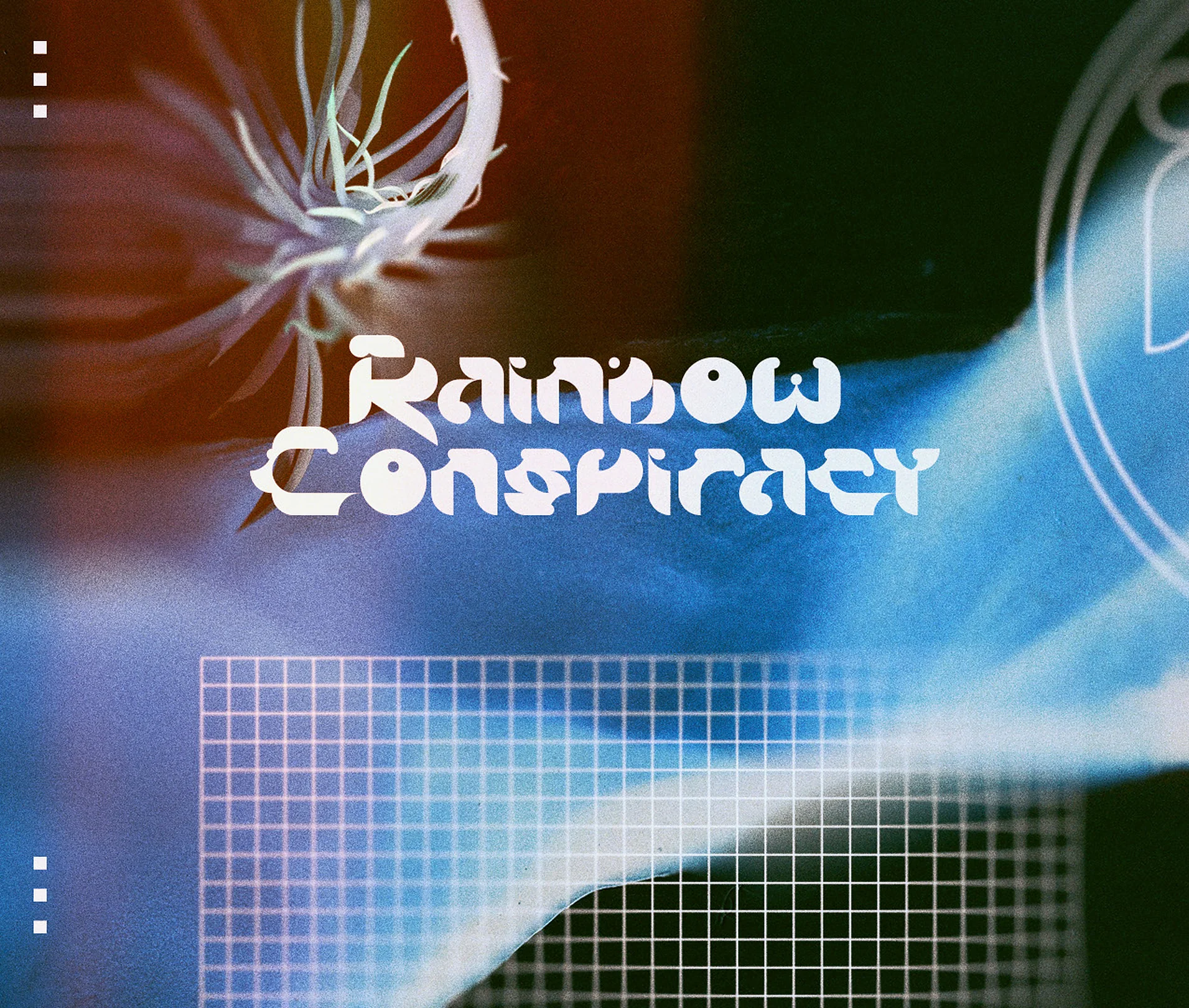
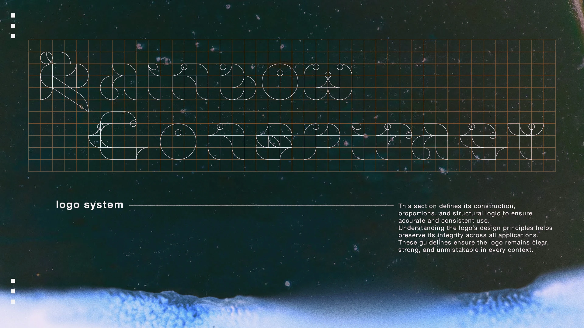
For Rainbow Conspiracy, an electronic music project, the challenge was particular: every release has its own mood and its own pictures, yet the name must be recognisable in a second. The identity we made rests on the three colours of light on a screen, red, green and blue, with a wordmark, a mark for small places and an alphabet drawn for the project.
The brand guide had to allow a lot of freedom while protecting a few fixed points. So it is short: how the wordmark is built, the safe area around the mark, the versions of the icon, the colour system and the typography. Those rules hold still, and everything else can change from one release to the next. That is the balance most guidelines are after: fix what makes the brand recognisable, and leave room for the rest.
Questions people ask
How long should brand guidelines be?
As short as they can be while answering the questions people really ask. For a small or new brand that is usually a few dozen pages at most, examples included. Larger brands with many channels need more, but every page should earn its place. Length is rarely the sign of quality; clarity and real examples are.
Can I use a brand guidelines template?
A template is useful as a checklist of sections, and the table in this guide can serve as one. It cannot supply the rules themselves, which come from your own identity and your own hard cases. Filling a generic template with generic statements produces exactly the kind of guidelines nobody reads or follows.
Who should own the brand guidelines?
One named person, usually in marketing or the design lead, with the authority to approve exceptions and the time to answer questions. An agency can write and update them, but the owner should sit inside the business, because day-to-day questions arrive constantly and need a quick, consistent answer.
How often should brand guidelines be updated?
Whenever the identity, a channel or a key file changes, and with a planned review once a year. Small updates, such as a new template or a new social format, can be added as they come. Date every version on the first page so that nobody works from an outdated copy.
What is the difference between brand guidelines and a brand identity?
The brand identity is the set of decisions: name, logo, colours, type, voice and imagery. Brand guidelines are the instructions for using those decisions correctly. You can have an identity without guidelines, but it tends to drift quickly once other people start producing work with it.
If your brand has an identity but no rules, or rules that nobody follows, the fix is usually smaller than it looks: a short, well-made guide with real examples and one owner. Our branding service covers identity and guidelines together, from the first decisions to the files your team will use every day. Talk to us about your brand and we will tell you what your guidelines need.
Further reading: Corporate video production cost: what drives the price.