- Client
- Rainbow Conspiracy
- Sector
- Music
- Location
- London, United Kingdom
- Year
- 2026
- Services
- Branding
- Website
- rainbowconspiracy.co.uk
- Also on
- Behance
About the project
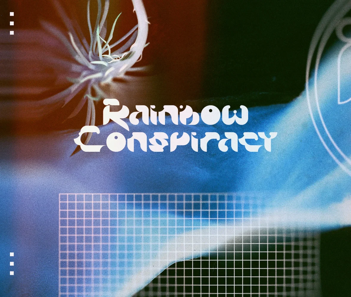
Rainbow Conspiracy is an ongoing electronic music project based in London. Its work moves between rhythm and atmosphere, and draws on club culture, memory and lived experience.
It prefers slow listening to immediacy and treats each release as a world of its own, told through music, image and gesture. We gave those worlds a common identity: a wordmark, an icon, an alphabet, a colour rule and the guide that holds them together. The identity extends to the artwork for the project’s releases.
The aim
An identity that designers and collaborators can apply without drifting from the artist’s vision.
The guide says as much in its introduction: its rules are there so that everything made for the project stays aligned, recognisable and true to that vision, whoever makes it.
What the guide covers
- The logo system: how the wordmark is constructed, the icon, and how both are applied.
- The colour system and the reasoning behind it.
- Typography: one typeface for titles, one for text.
What we made
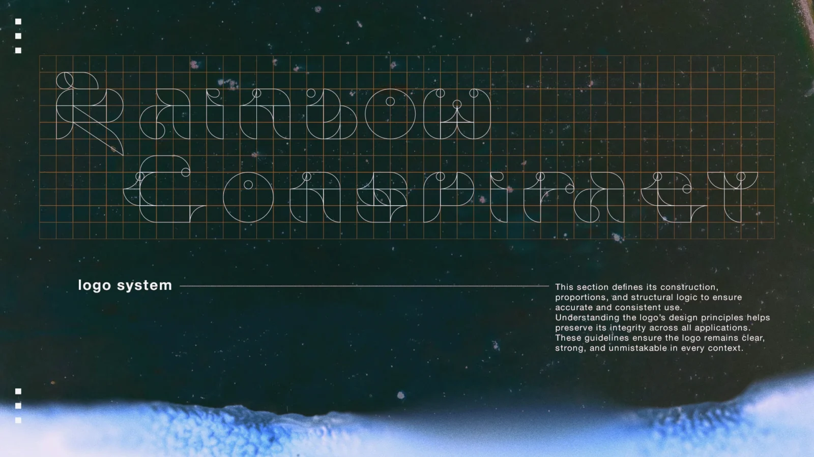
Every part starts from the same few shapes: arcs, circles and straight lines on a square grid.
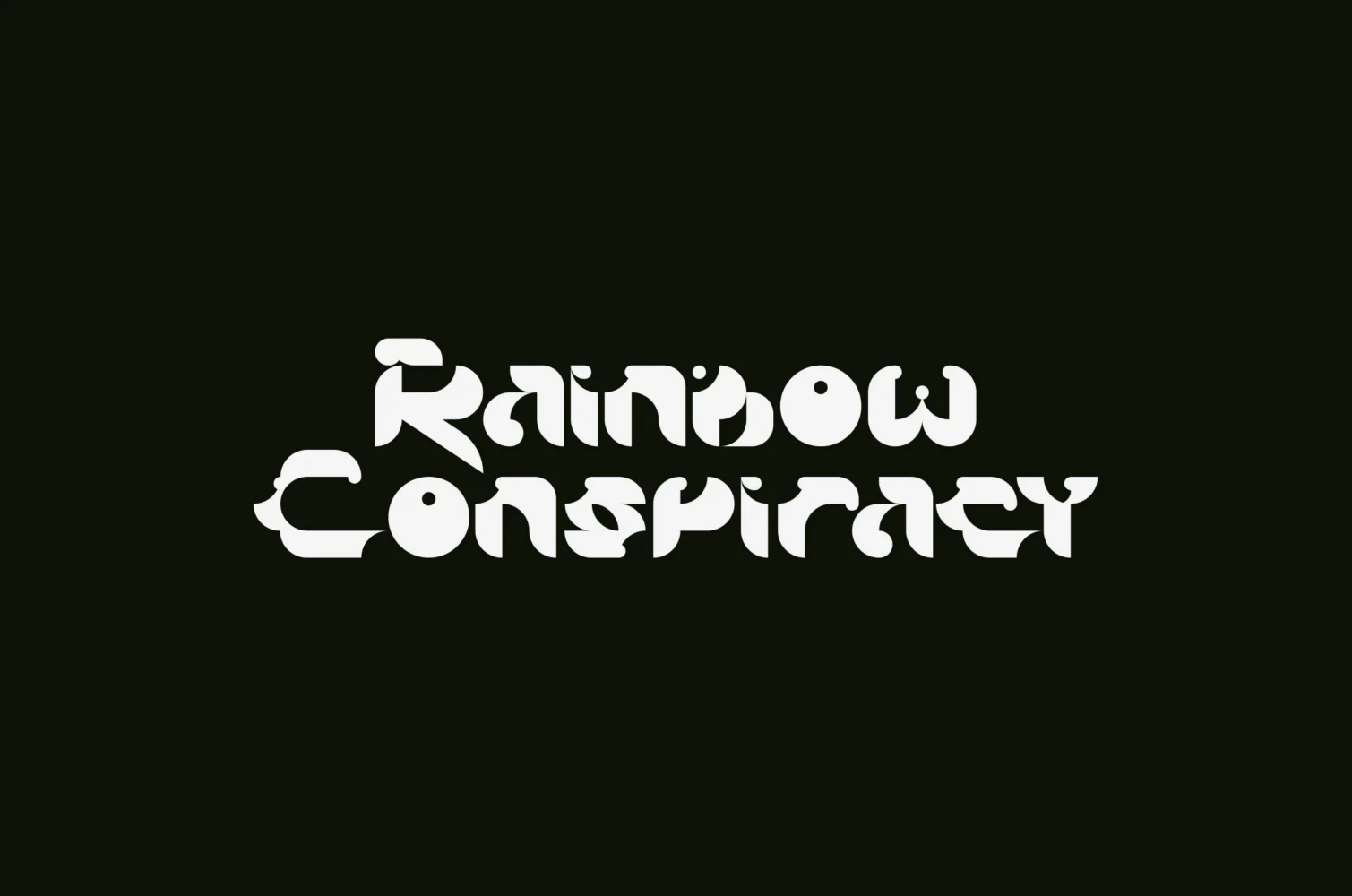
Wordmark
The name on two lines, in letters drawn for the project. Supplied in positive and negative.
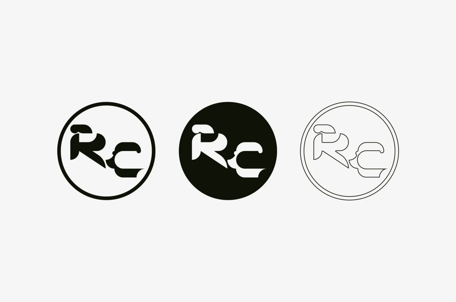
Icon
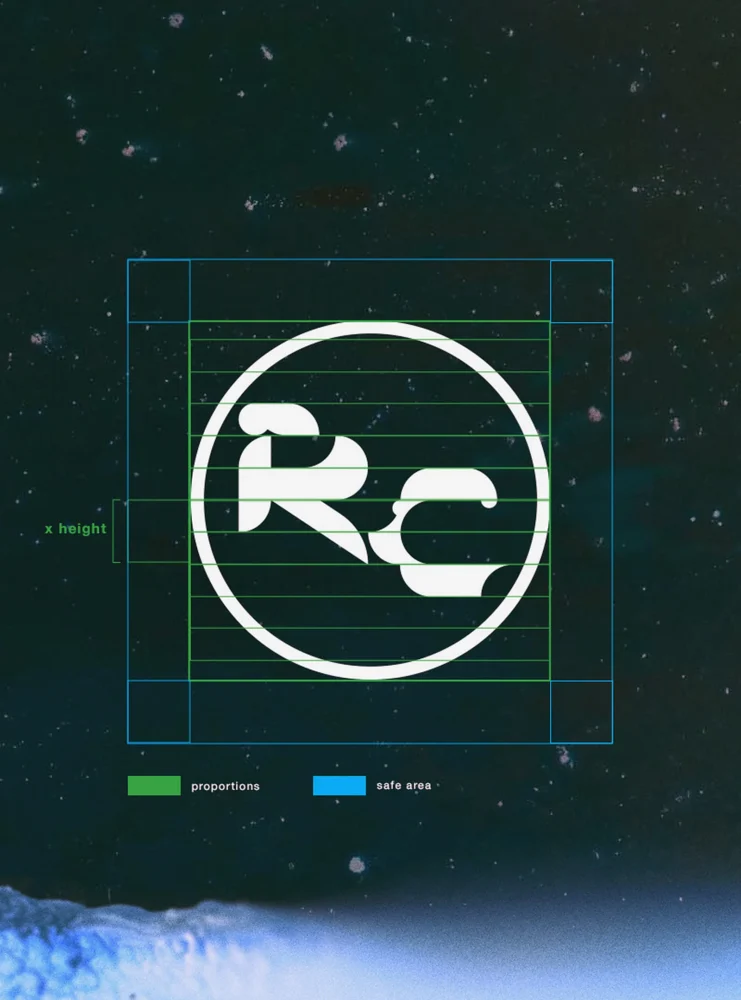
The initials R and C in a circle, as an outline, a solid disc and a fine line.
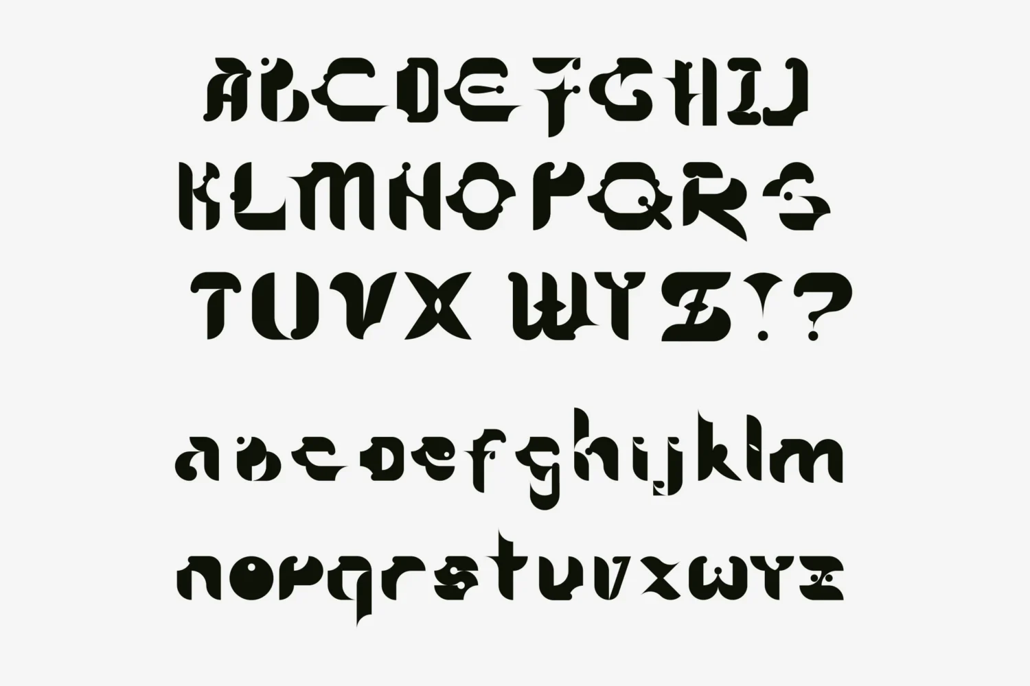
Alphabet
A full alphabet, capitals and lower case, drawn in the manner of the wordmark.
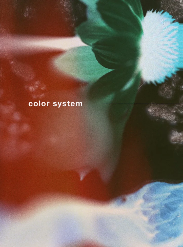
Colour
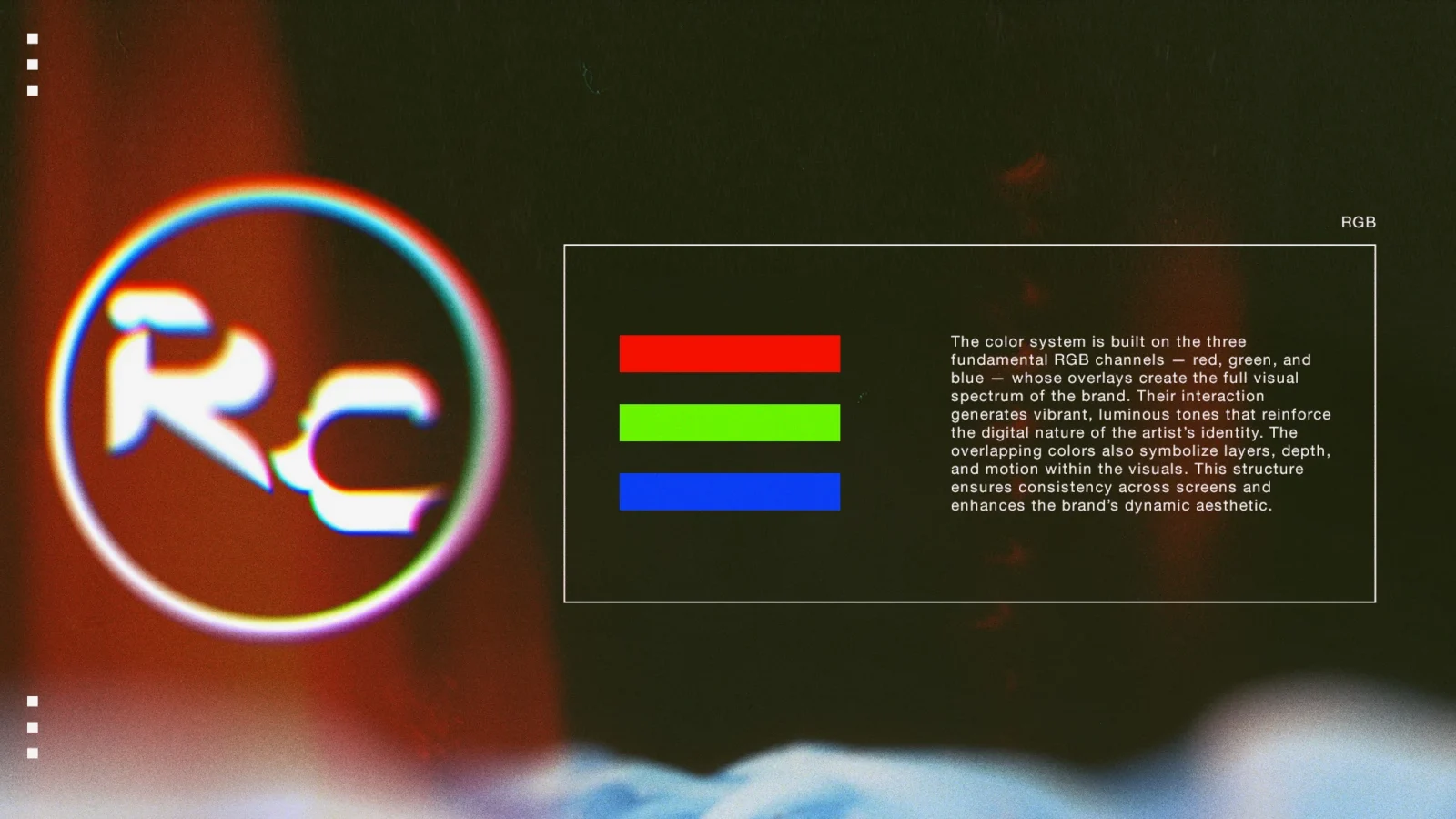
A colour rule built on the three channels of a screen: red, green and blue.
Typography
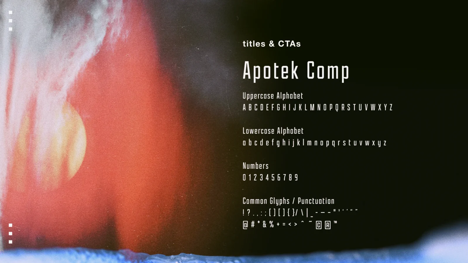
Two typefaces with a job each: Apotek Comp and Helvetica Neue.
Brand guide
The rules in one document: construction, clear space, positive and negative use, colour and typography.
How it works
The guide keeps its rules few and exact.
Grid and clear space
The wordmark is built on a grid. Its proportions, and the space kept clear around it, are measured in its own x-height. The icon follows the same rule.
Red, green and blue
Colour comes from the three channels of a screen. Their overlaps give the identity its full spectrum, and the guide reads them as layers, depth and motion.
Two typefaces
Apotek Comp, tall and condensed, sets titles and calls to action. Helvetica Neue sets text and general information.
One picture world
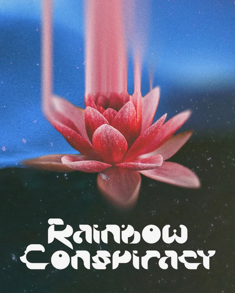
The pages of the guide share their imagery: flowers in close-up, light drawn out into bands, and grain over near-black.
Delivered
The brand guide, the wordmark and the icon as vector files, and the alphabet.
Identity work of this kind is part of our branding service. If your project needs a visual language of its own, tell us about it.