- Client
- Torto Cozinha
- Sector
- Restaurant
- Location
- São Paulo, Brazil
- Year
- 2025
- Services
- Branding
- @tortocozinha
- Also on
- Behance
About the project
Torto Cozinha is a restaurant in Pompeia, São Paulo. Its kitchen starts from French cooking and takes it somewhere else: the house sums up the route as “from classic to chaos”.
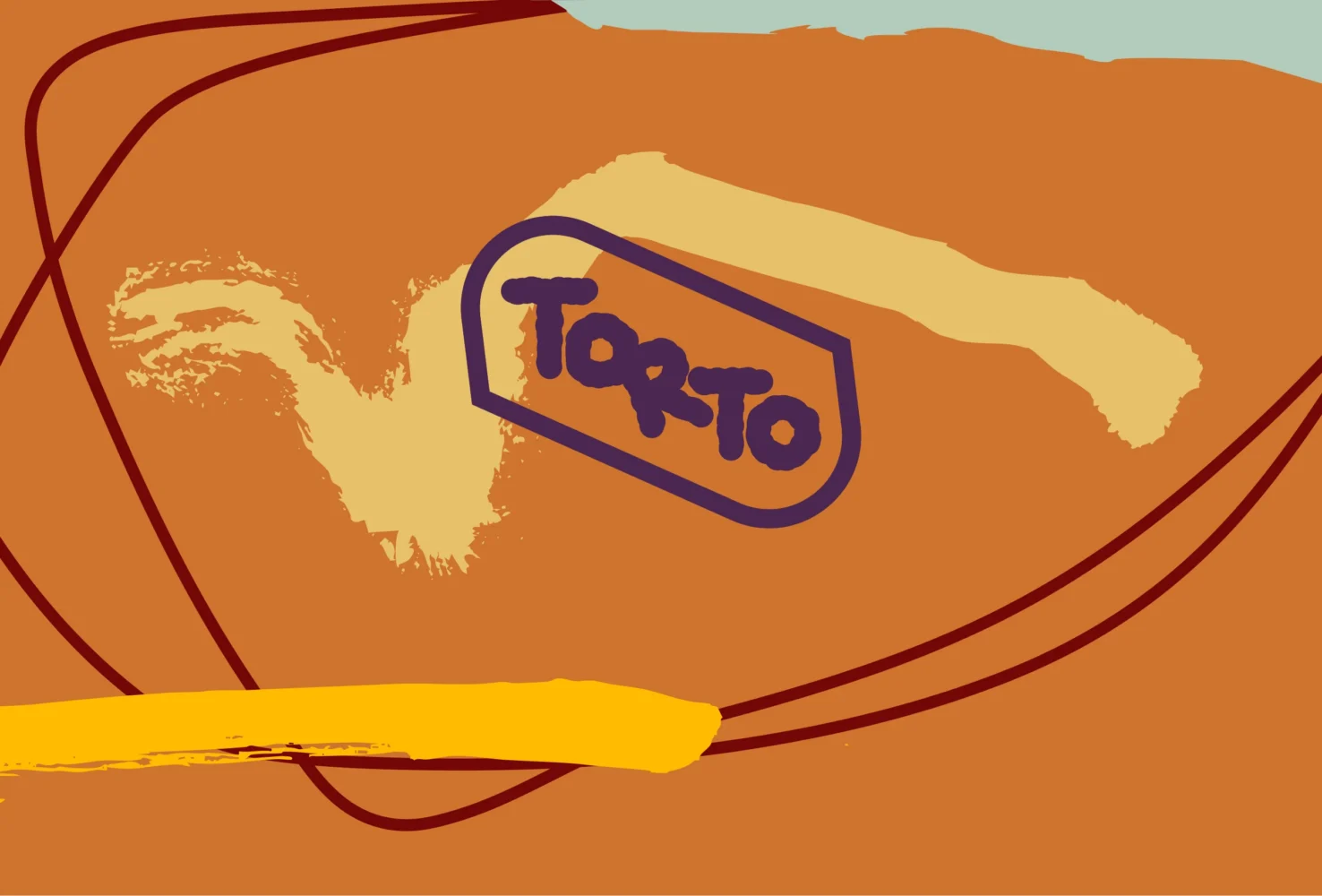
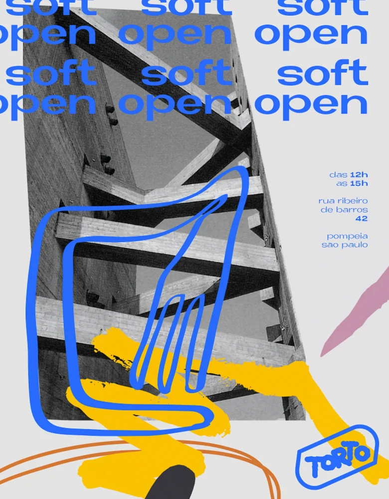
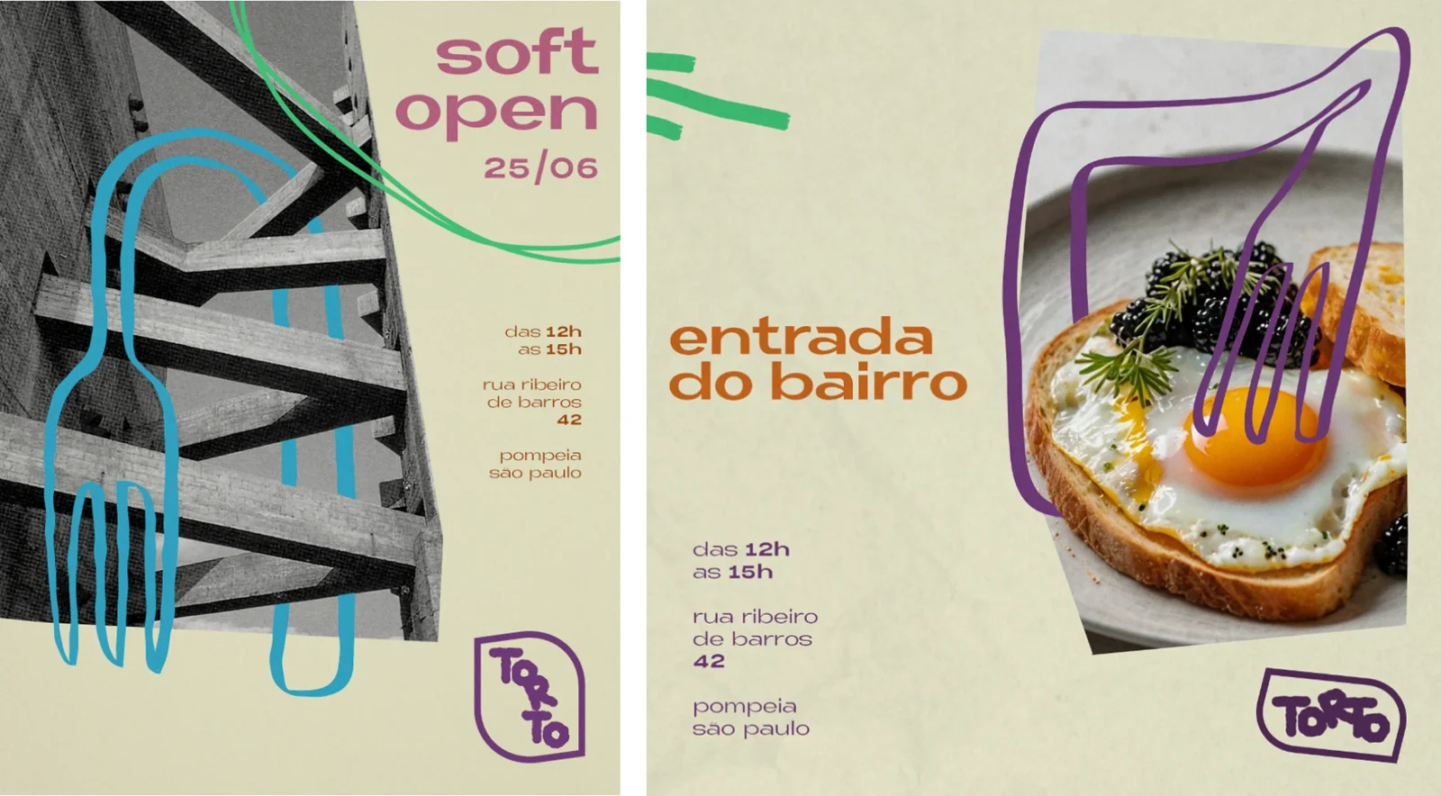
Torto is the Portuguese word for crooked, and the menu has lived up to it, pairing bread and egg with caviar, and tonka bean ice cream with chips. We gave the restaurant an identity that behaves the same way: a hand-drawn logo that can be taken apart and put back together, a palette that runs from loud to quiet, a library of brushstrokes and bent forks, and the manual that says how far each of them may go. It was designed in 2025, before the doors opened, and the manual carries the announcements of the soft opening.

The aim
A logo that must always be read, and may otherwise do as it pleases.
That is the manual’s own rule. The brand stands on a controlled structure so that it can be taken apart and reconfigured for each use: reading comes first, and beyond that the composition is free to change from one piece to the next.
What the manual covers
- The brand: its structure, its forms and every arrangement of the logo.
- Typography, and a palette in four groups of colour.
- Three libraries to compose with: elements, illustrations and textures.
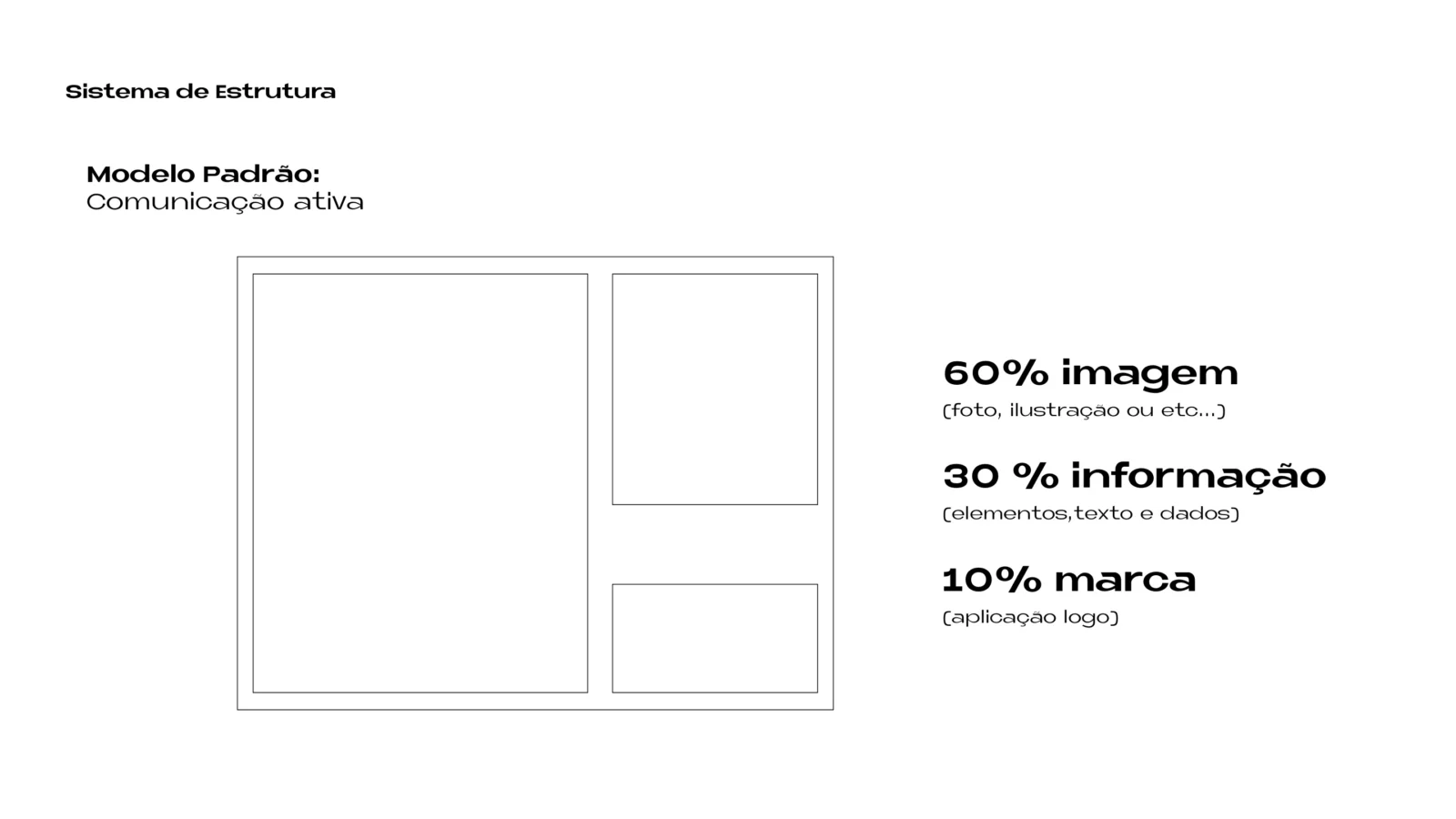
- Layout: how a piece divides its surface between image, information and brand.
What we made
One word, drawn by hand, and a kit of parts to set around it.
Logo
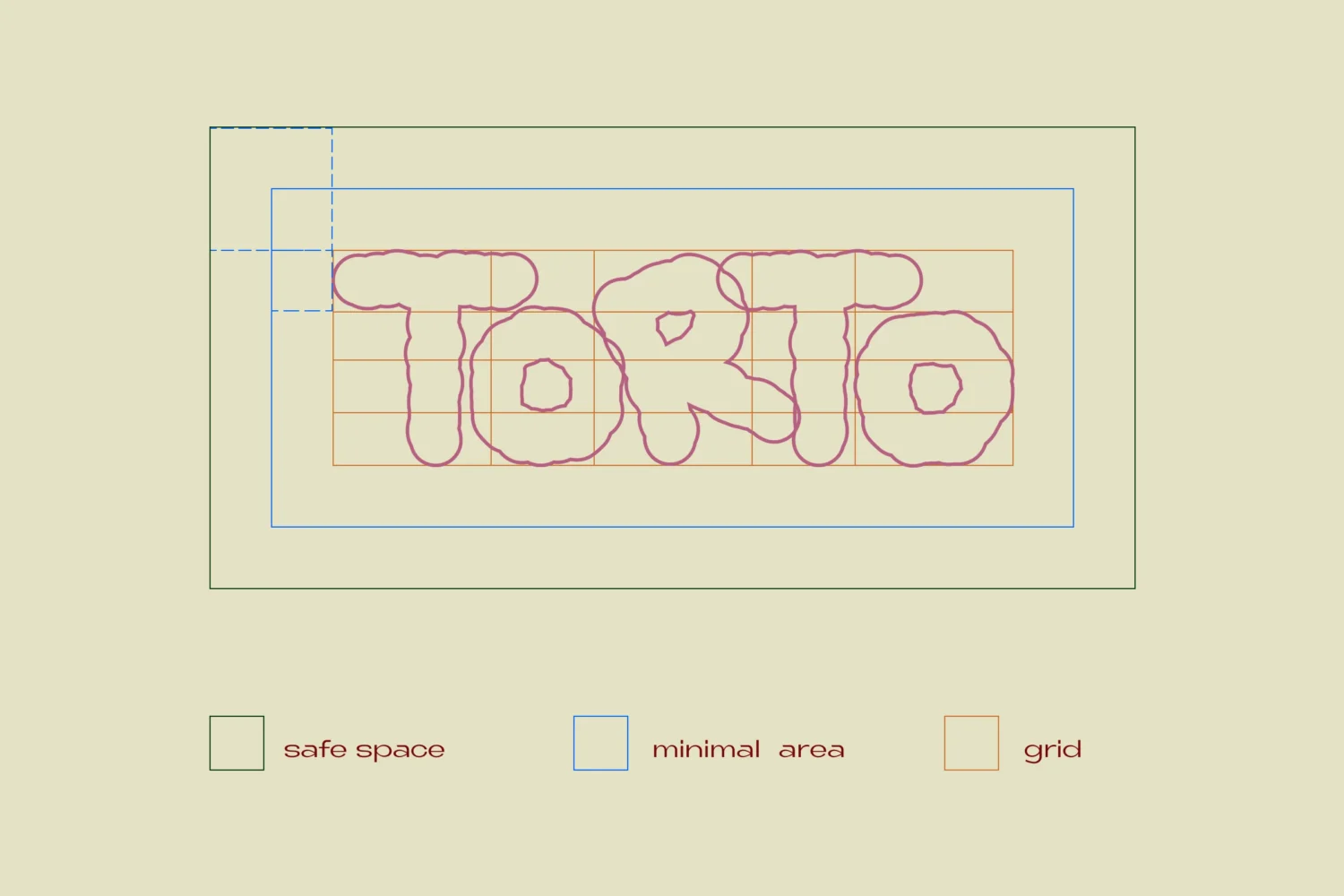
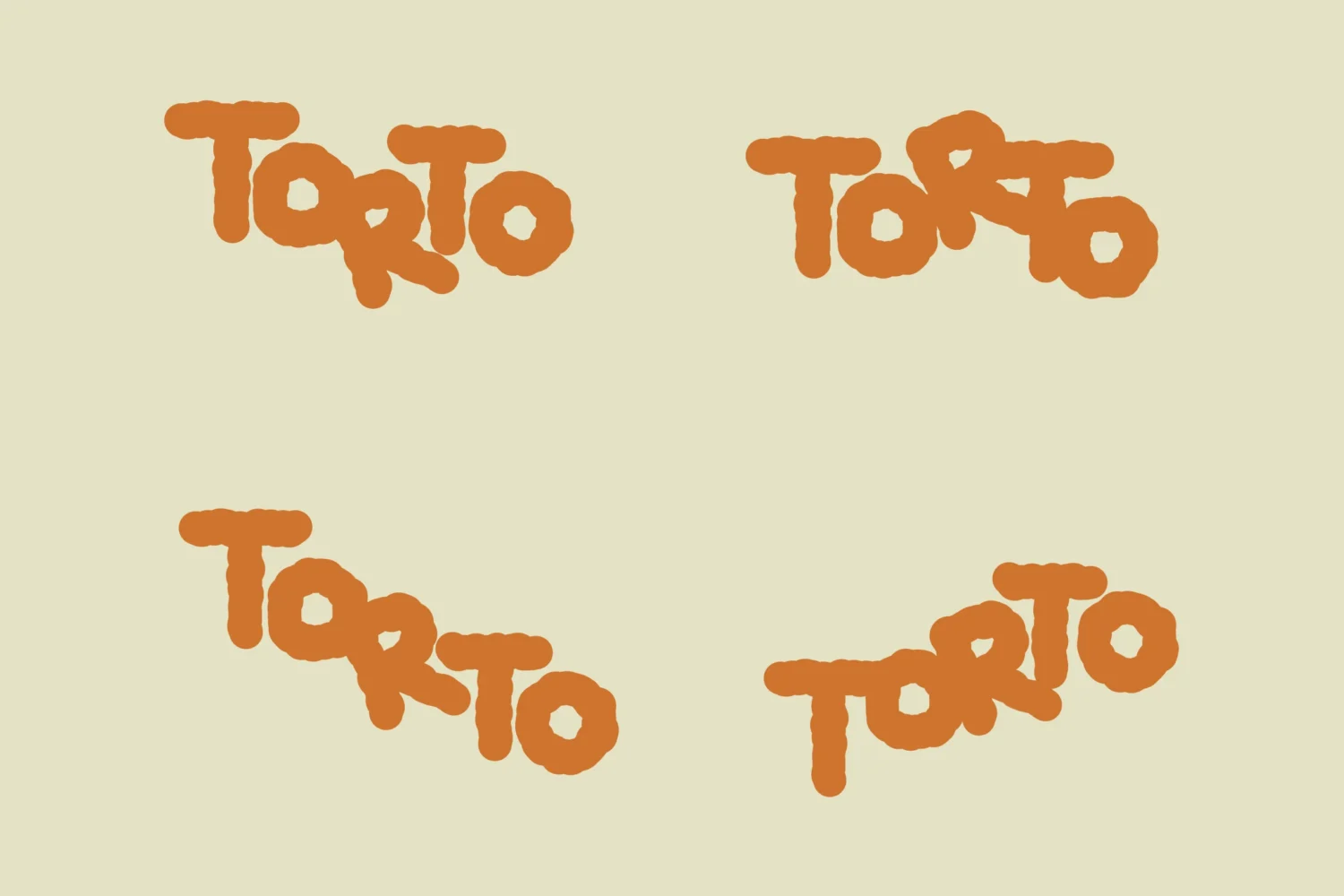
The name in thick, hand-drawn letters, each a little off its axis. Built on a grid, with its safe space and a minimum size of four centimetres.
Arrangements
Sixteen of them: horizontal and vertical, with and without a frame, the letters tilted and stacked a different way each time.
Typography
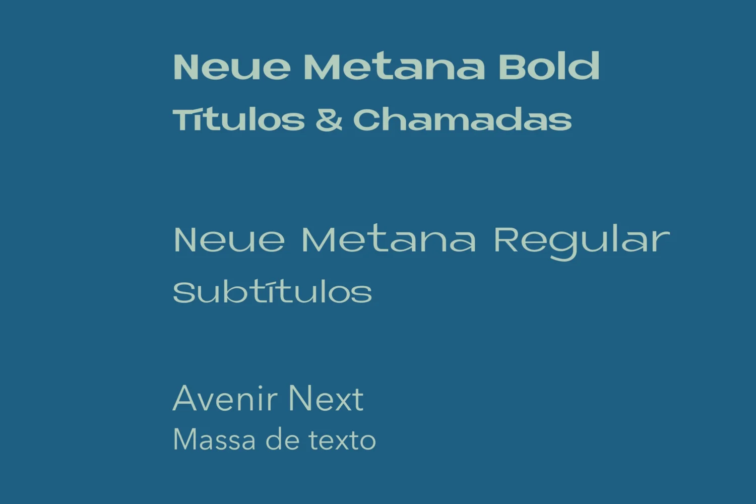
Neue Metana Bold for titles and callouts, Neue Metana Regular for subtitles, Avenir Next for body text.
Colour
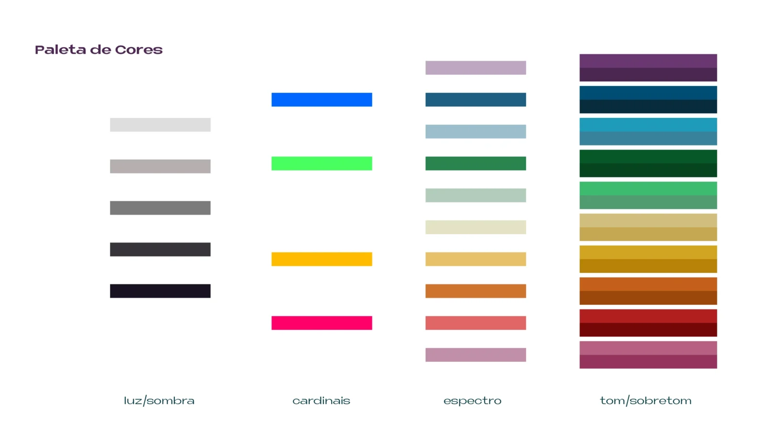
A palette in four groups: light and shadow, four cardinal colours, a spectrum of ten, and ten pairs of tone and overtone.
Elements
A library of marks to compose with: vector scribbles, brushstrokes, pen lines and torn shapes.
Illustrations
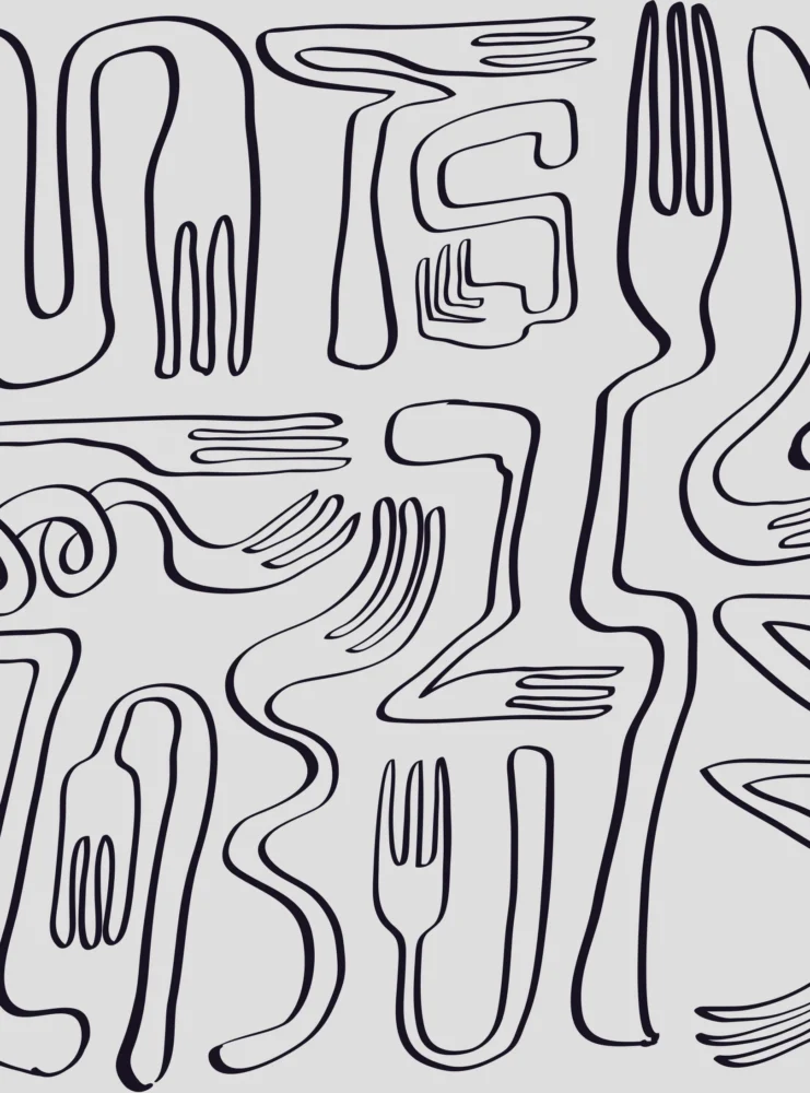
A library of forks in line drawing, bent, looped and stretched out of shape.
Textures
A set of textures to lay over a piece, sorted into light, medium and dense.
Layout system
Three models that fix how much of a piece goes to image, to information and to the brand.
In motion
An identity built from parts is best seen moving.
Each piece below is made only from the brand’s own artwork, taken apart and set back together in the order it was drawn.
How it works
The manual gives the freedom, then says where it stops.
Reading comes first
The logo is built on a grid, with a safe space and a minimal area around it. However it is rearranged, the name must still read.
Colour from four points
The palette starts from four exaggerated cardinal colours: blue, green, yellow and pink. Quieter neighbours follow from them, and tones and overtones fill the gaps between one colour and the next.
Forks over photographs
The drawings may be laid over any kind of image on three conditions: black and white, a crooked cut, and a drawing that plays with the photograph wherever it can.
Textures by weight
Textures are multiplied over a piece, never stronger than the manual allows: up to 15% for dense ones, 20% for medium ones and 30% for light ones.
Three layout models
Image, information and brand share each piece by rule: 60, 30 and 10 per cent for active communication, 40, 30 and 30 for brand communication, 30, 60 and 10 for information.
Libraries, not templates
Every element is filed in its folder, ready for new compositions. The manual expects the brand to adapt and evolve as it is used.
Delivered
The identity and its brand manual: the logo and its arrangements, typography, palette, the libraries of elements, illustrations and textures, and the layout system.
Identity work of this kind is part of our branding service. If your business needs an identity with a character of its own, tell us about it.