- Client
- MONU Molduras
- Sector
- Picture framing
- Location
- São Paulo, Brazil
- Year
- 2025
- Services
- Branding
About the project
MONU Molduras is a picture framing shop in São Paulo. It frames to measure: work floated between two sheets of glass, framing to museum standard, box frames and sports shirts.
A frame is made to be overlooked: it is there so that something else gets the attention. The shop that makes it needs the opposite from its own name, a mark that holds its ground at any size and is recognised at a glance. The name already stood in two rows, MO over NU. The rebranding keeps that arrangement and redraws everything else: letters with the weight of a moulding, one stroke that shows the craft, a symbol, a family of signatures and a pattern, all of it in black and white.

The aim
Give the name the weight of a frame, and leave the colour to the pictures.
Framing is judged on square corners and clean joints, so the identity takes its vocabulary from the workshop: letters drawn as blocks, strokes cut on a slant where they meet, and hatching, the way a technical drawing marks a cut surface. Black and white are the only colours. Whatever goes inside a MONU frame brings its own.
What the identity covers
- The logo: the name in two rows over a bar that carries the word Molduras.
- A symbol, alone and inside a ring.
- Signatures that set the symbol beside the name or above it.
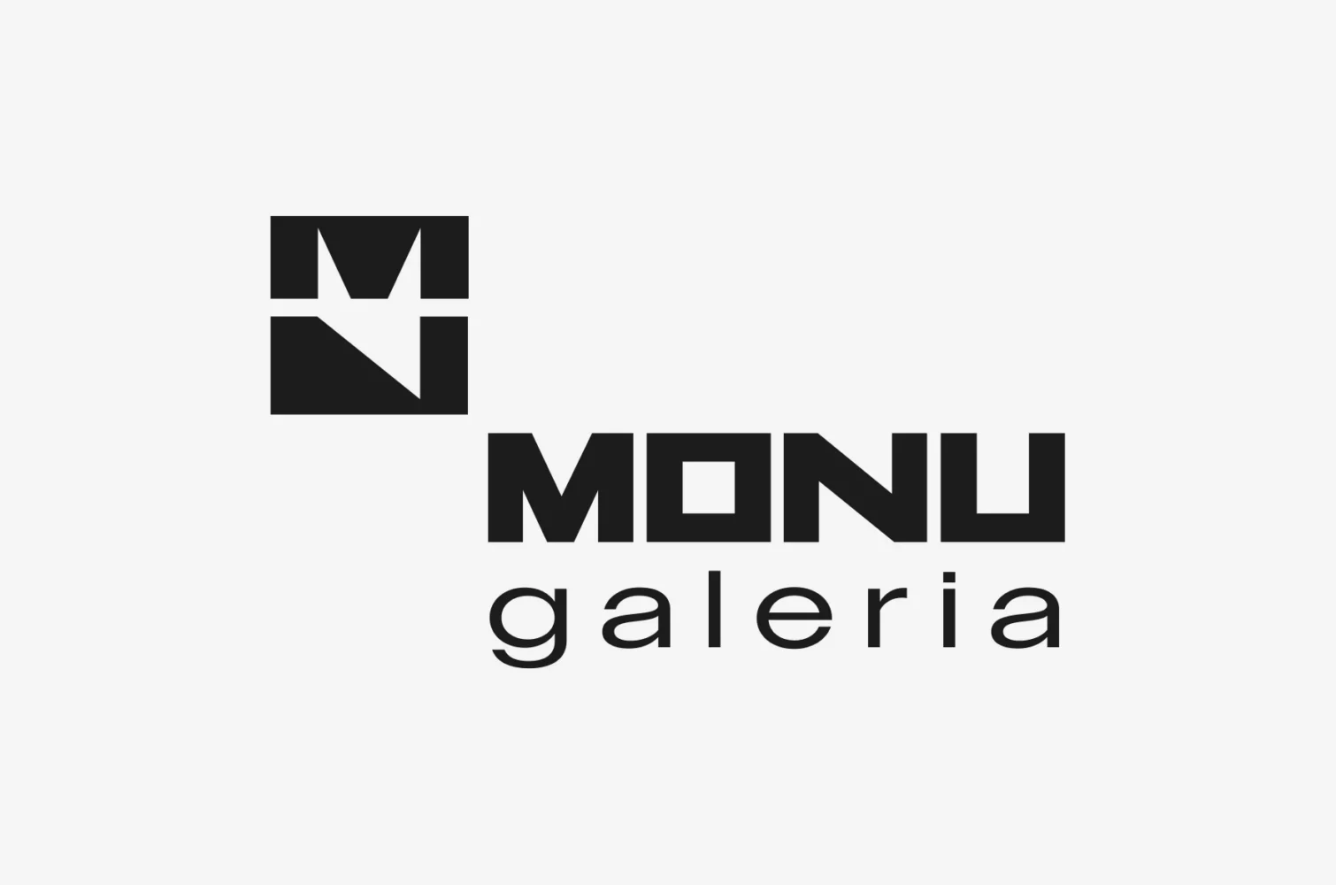
- A second descriptor, Galeria, with a monogram of its own.
- A pattern built from the four letters.
What we made
Four letters drawn as blocks, and a set of marks cut from the same shapes.
Logo
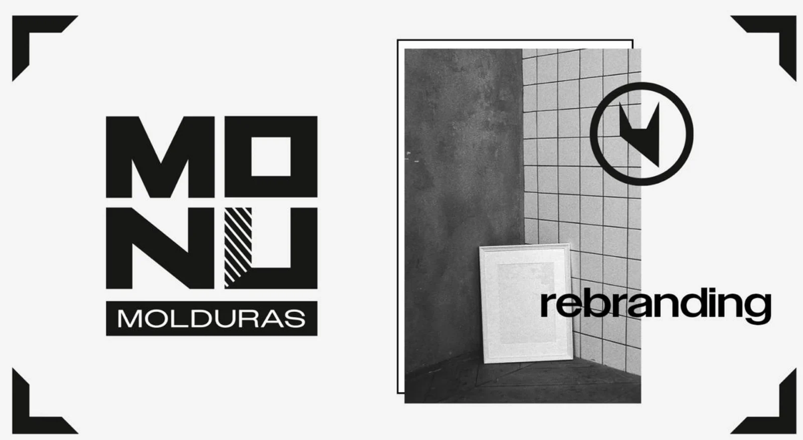
MO over NU: four heavy letters, each drawn to fill its own block. The O is a square with a square opening, which is to say a frame seen from the front.
The hatched stroke
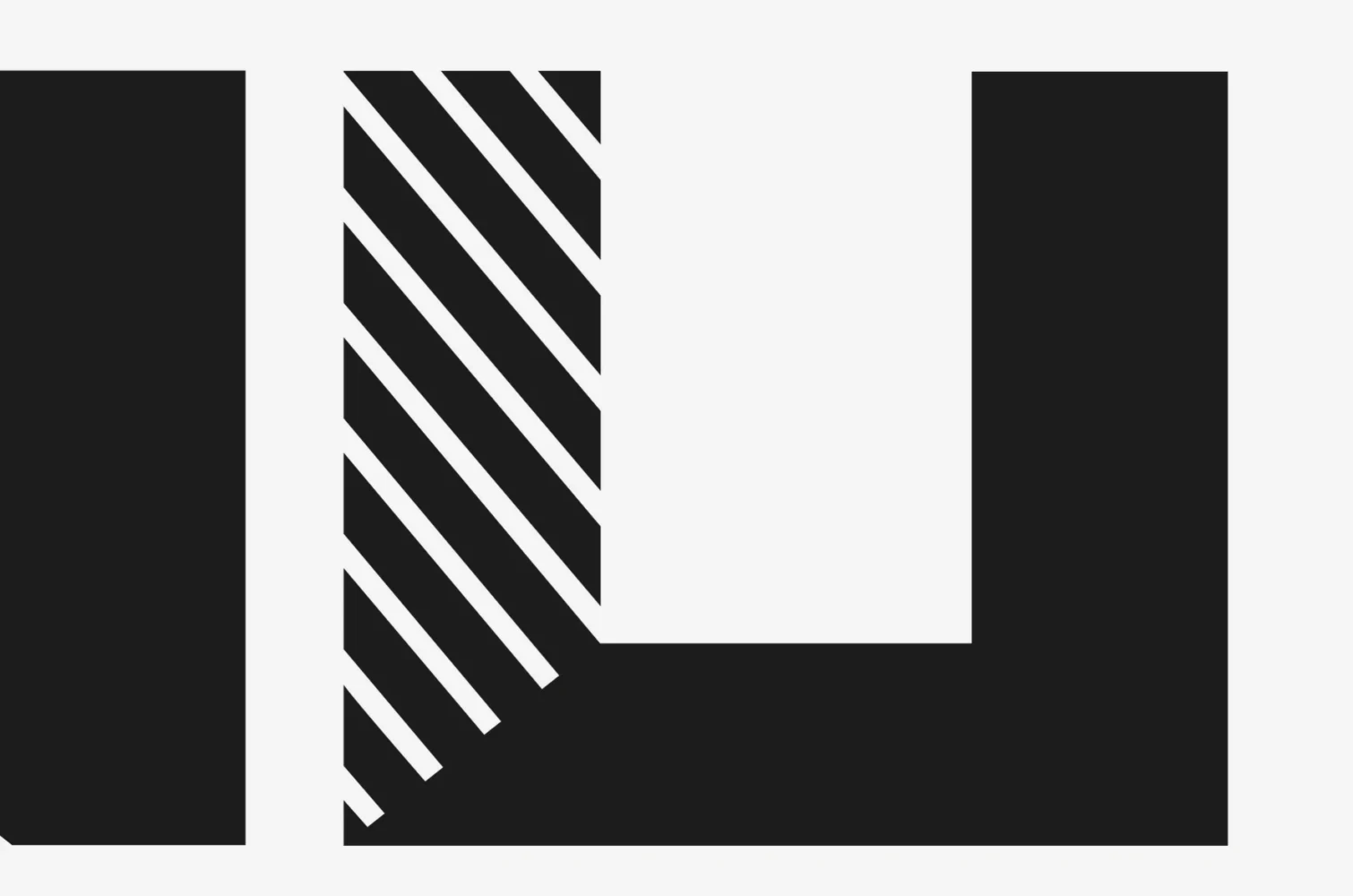
The left stroke of the U is filled with diagonal lines and cut on a slant where it meets the base of the letter. That cut is a mitre, the joint at every corner of a frame.
The bar
Under the letters, a bar the width of the logo carries the word Molduras in reverse, the way a plate carries a title under a picture.
Symbol
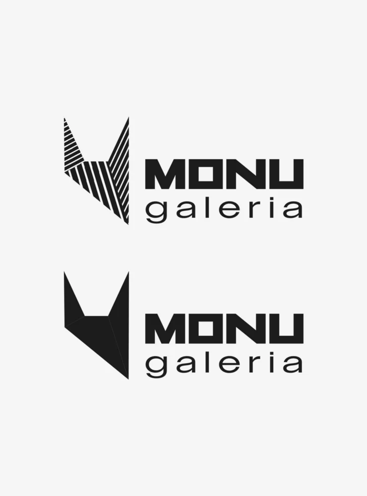
One shape with two points at the top and a long diagonal edge. It takes the notch of the M and the diagonal of the N, and stands alone, inside a ring or beside the name.
Signatures
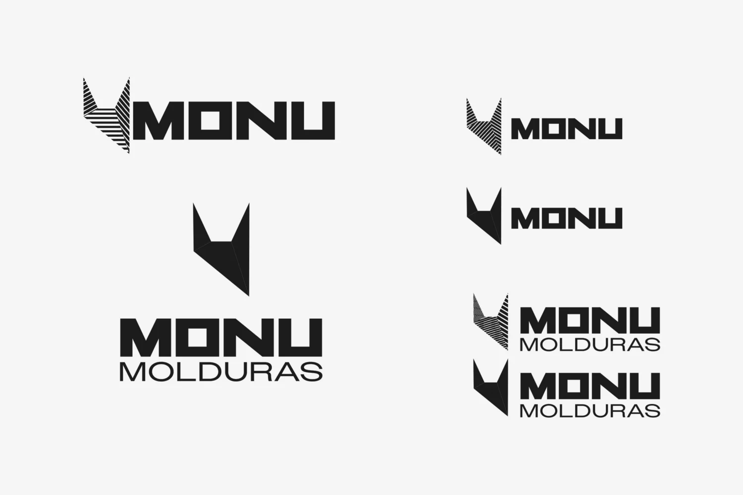
Arrangements of symbol and name for the places a square logo does not fit: the symbol beside MONU, and beside or above MONU Molduras.
Galeria
A second descriptor, set in open lower case under the name, and a monogram to go with it: M over N in two squares.
Pattern
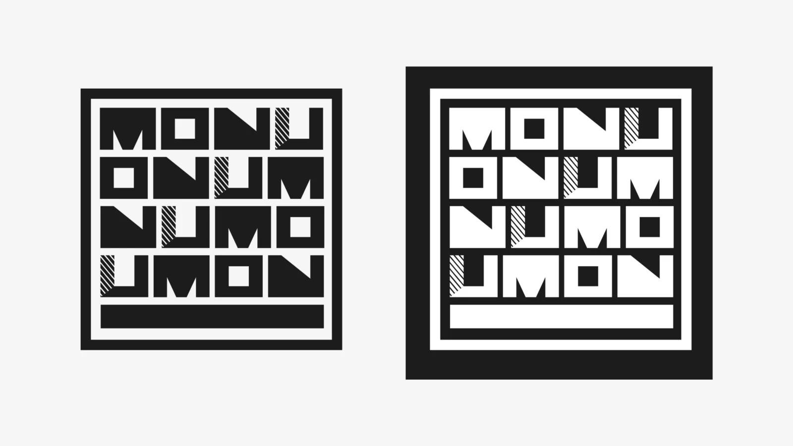
The four letters in four rows, each row starting one letter later: MONU, ONUM, NUMO, UMON. A border holds them, with a bar underneath, as in the logo.
Typography
Owners XWide, a wide sans-serif, for the descriptors: capitals for Molduras, lower case for Galeria.
How it works
Every part is a frame, or is cut like one.
Blocks and channels
The logo is four blocks and a bar, held apart by narrow channels. It makes a block of its own, with straight sides, that sits square against any edge.
The hatching travels
The hatching appears once in the logo. It returns in the pattern, on the same stroke of every U, and on the symbol, where each facet is hatched in a direction of its own.
Solid or hatched
The symbol is drawn two ways, solid and hatched, and the signatures come with either.
Positive and negative
The pattern is drawn black on white and white on black. In the negative version a white band and a wide black border surround the letters, as a mount and a frame surround a picture.
Two descriptors
Molduras sits in the bar, or under the name in capitals; Galeria runs under the name in lower case. The four letters of MONU are the same in both.
Corner marks
In presentation the identity sits on pale grey beside a black-and-white photograph, held by four black corner marks: the corners of a frame with the sides left out.
Delivered
The rebranding of MONU Molduras: the logo, the symbol and its ring, the signatures, the Galeria descriptor and its monogram, and the letter pattern, in black and white.
Rebranding of this kind is part of our branding service. If your name has outgrown its logo, tell us about it.