Skip to content

Odduel

We put the odds in your favour

  • Barcelona, Spain Headquarters+34 XX XXX XX XX
  • São Paulo, Brazil Local team+55 11 99973-3646
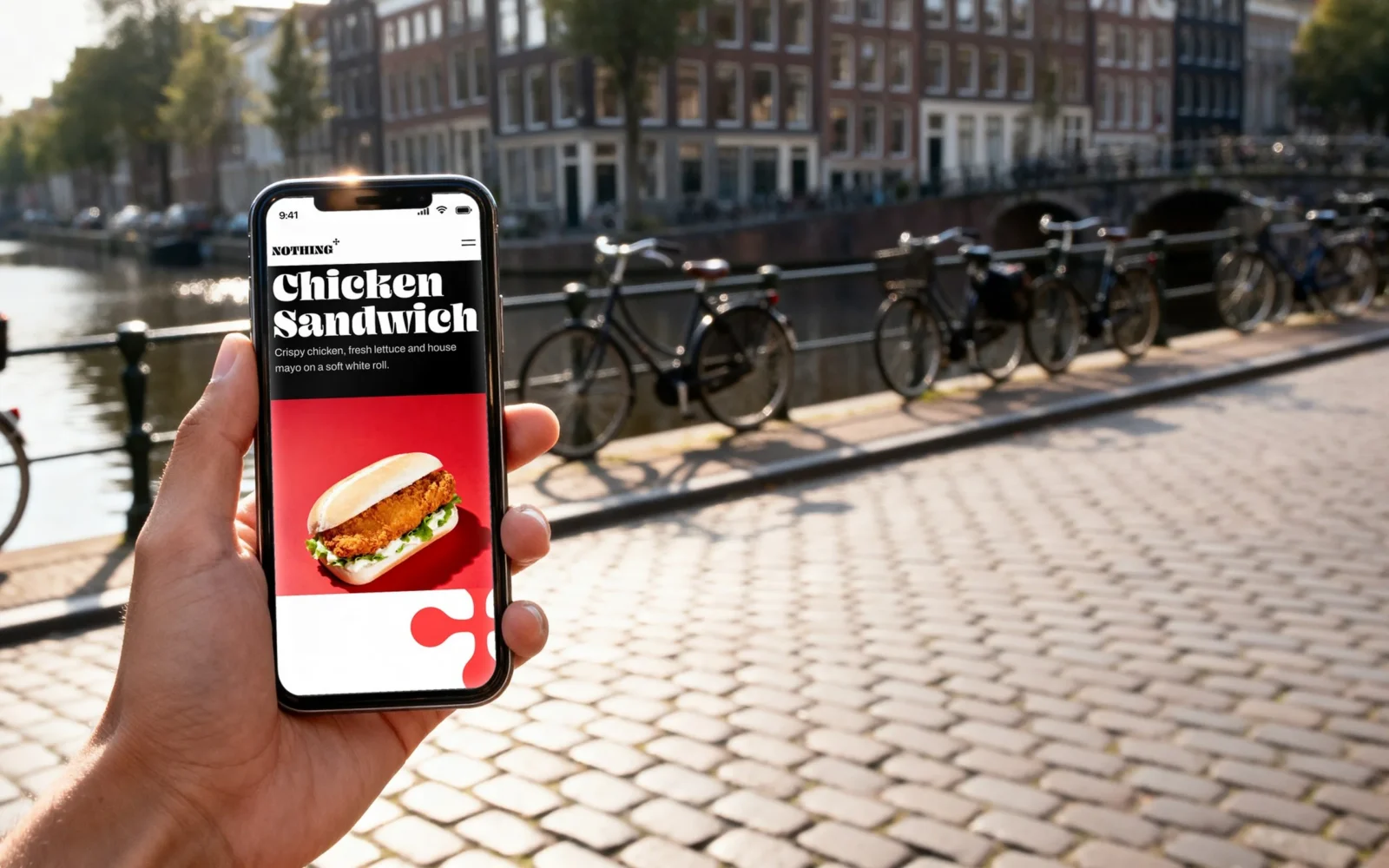
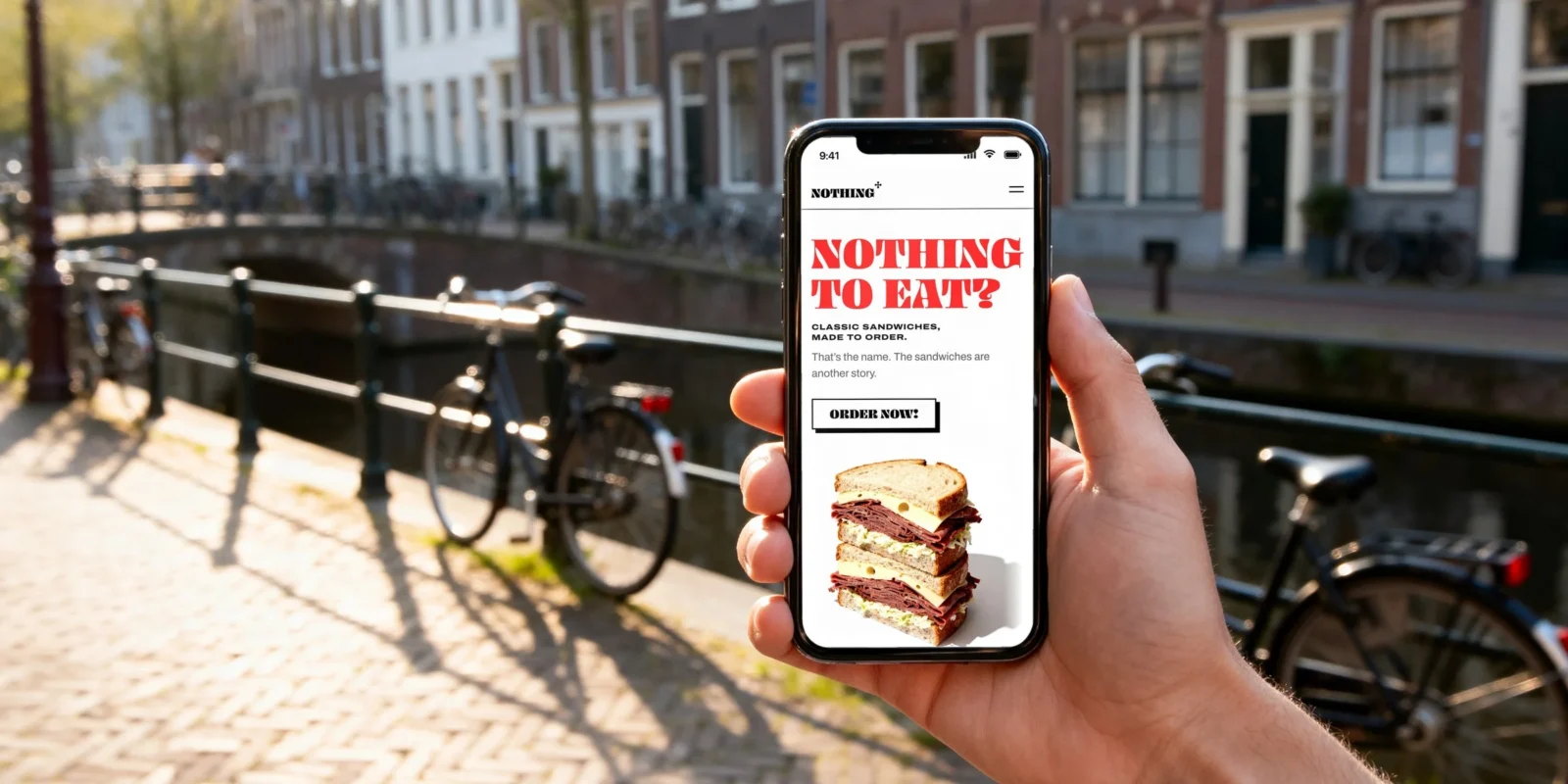
A hand holds a phone by a canal in Amsterdam, bicycles against the railing behind; the screen shows the Nothing To Eat website: red lettering "NOTHING TO EAT?", a button "ORDER NOW!" and a pastrami sandwich.

Portfolio

Brand identity, packaging and website

Nothing To Eat

Sector
Food
City
Amsterdam
Year
2026
Agency
Odduel
Creative Director
Luciano Panachão
Also on
Behance

A name that makes you hungry.

Nothing To Eat is a sandwich brand from Amsterdam. We gave it an identity, packaging and a website, all built on the joke in its name.

Everyone has stood in front of an open fridge and said it. The brand says it louder: “NOTHING TO EAT?” in heavy white capitals on red, with one answer underneath, “ORDER NOW!”. A question and its answer. That is the whole idea, and every piece of the brand comes back to it. The logo keeps only the first word, so every bag and box says “NOTHING” while holding something very good.
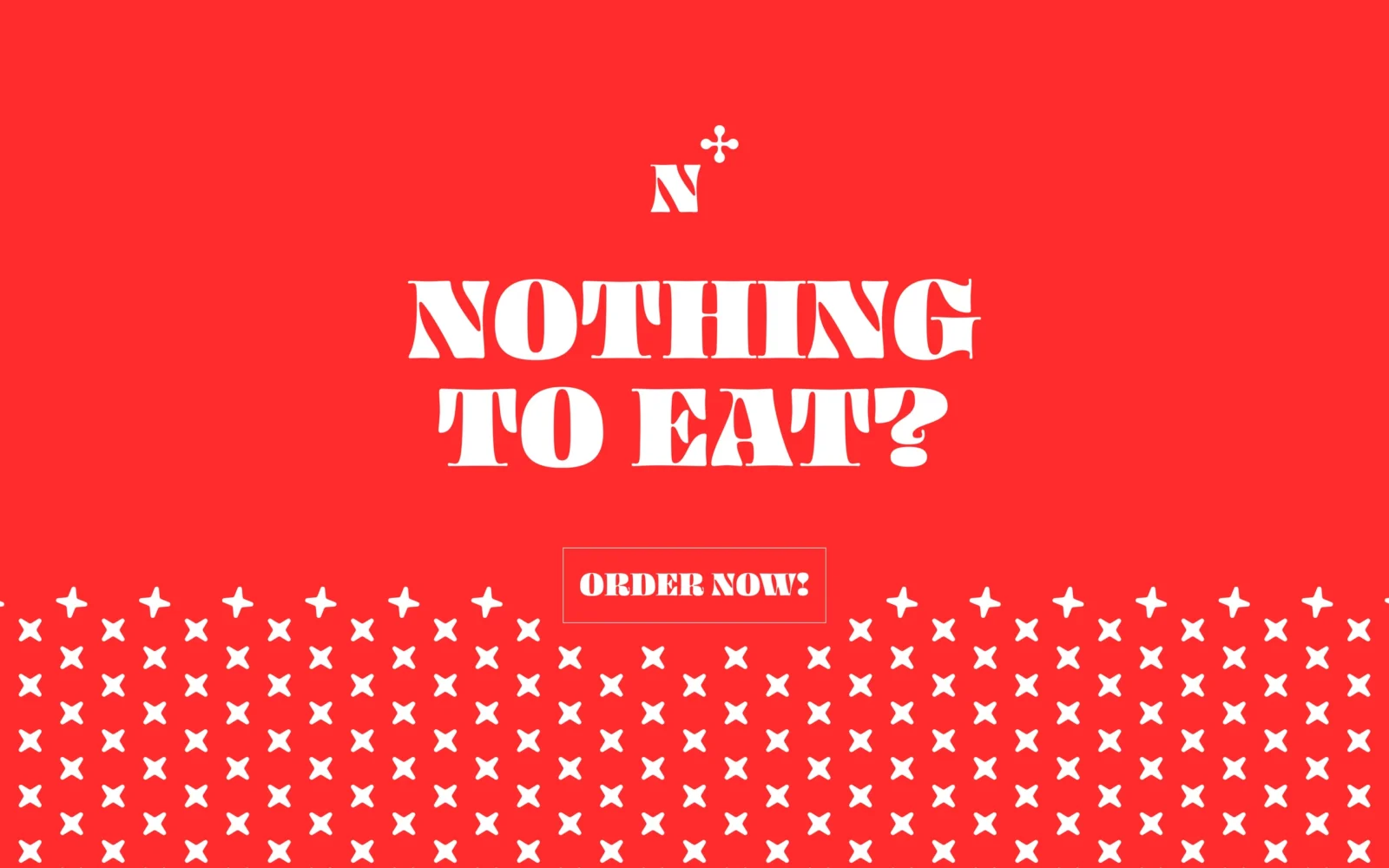
On a red field, white lettering reads "NOTHING TO EAT?" above an outlined button that reads "ORDER NOW!"; rows of small white crosses fill the lower third.

A shop you can already picture.

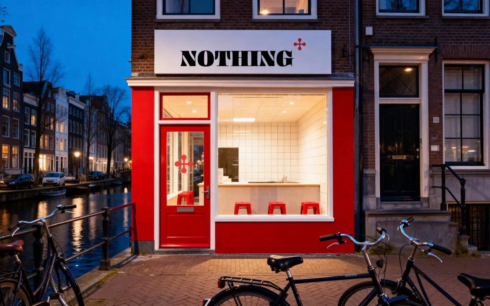
A red front on an Amsterdam canal, the name on a white sign.

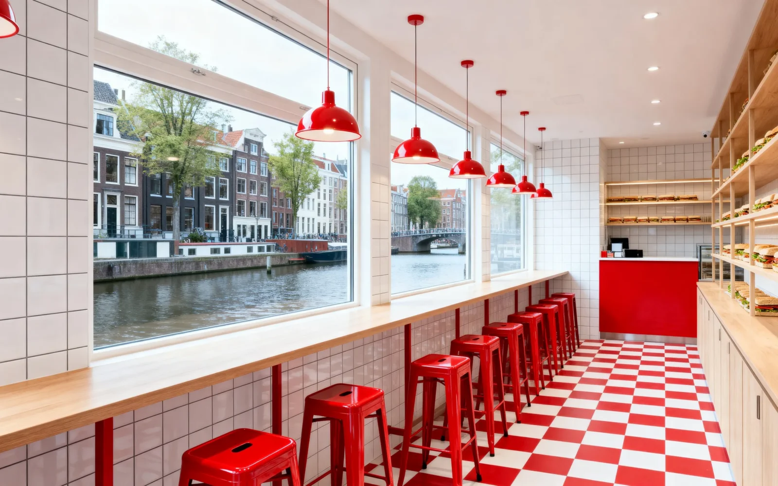
We art-directed the brand in a shop of its own, so every piece could be judged where it will live: in a hand on the street, on the counter, on the wall. Red front, white tiles, red stools by the window, the mark on the door glass. It feels like a place you have walked past a hundred times and finally want to try.

A red shopfront on an Amsterdam canal at dusk, the "NOTHING" logo on a white sign above the window and the mark on the door glass, bicycles in front.
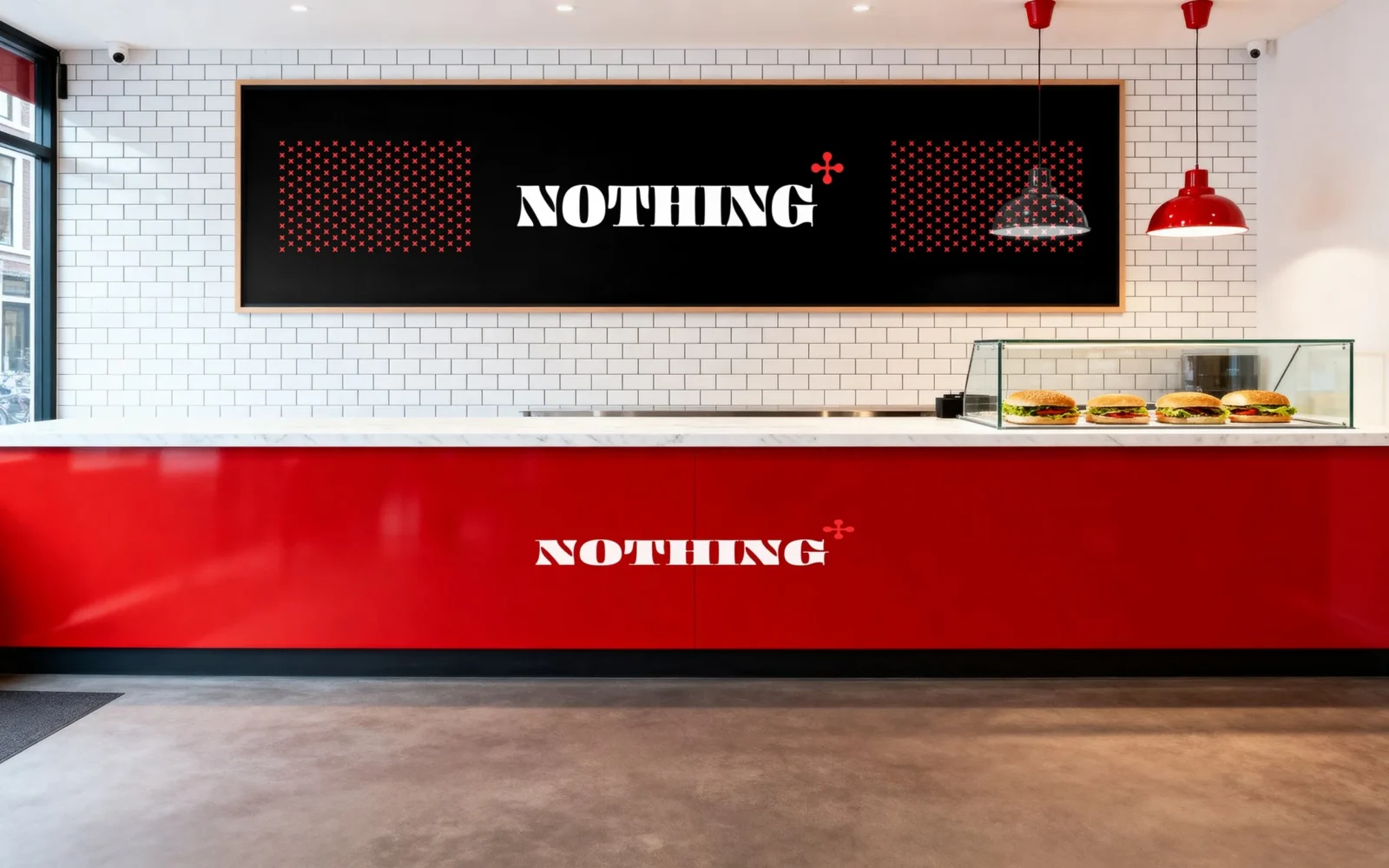
Inside: a red counter carrying the white "NOTHING" logo, white tiles behind and a black board with the logo between two fields of the pattern.
Inside: a red and white chequered floor, red stools along a window over the canal and red lamps above.

One word, and a wink.

The logo says “NOTHING”. The little red mark beside it says otherwise.

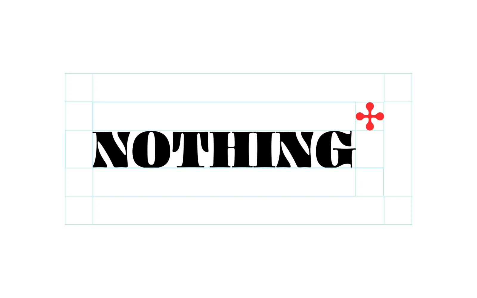
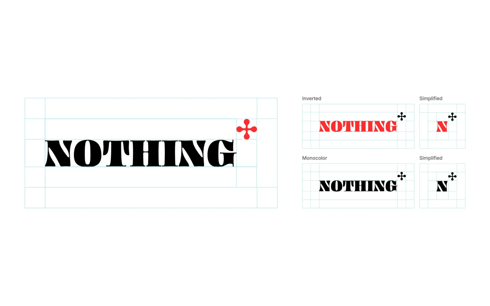
A heavy serif wordmark, confident and a little old-school, with a four-lobed mark at its shoulder: a plus sign, the hint that there is more. Drawn on its own grid, it comes in five versions so it holds up anywhere, from a shop sign to a sticker.

Five versions

  • The main logo: black wordmark, red mark.
  • Inverted: red wordmark, black mark.
  • One colour: all black.
  • The single N with the mark, in red and in black.
The black wordmark "NOTHING" and its red mark inside a grid of thin pale blue construction lines, on white.
Five versions of the logo, each on a pale blue grid: a large black "NOTHING" with a red mark, a red "NOTHING" with a black mark, an all-black version, and a red and a black letter N with the mark.

A pattern you can spot across the street.

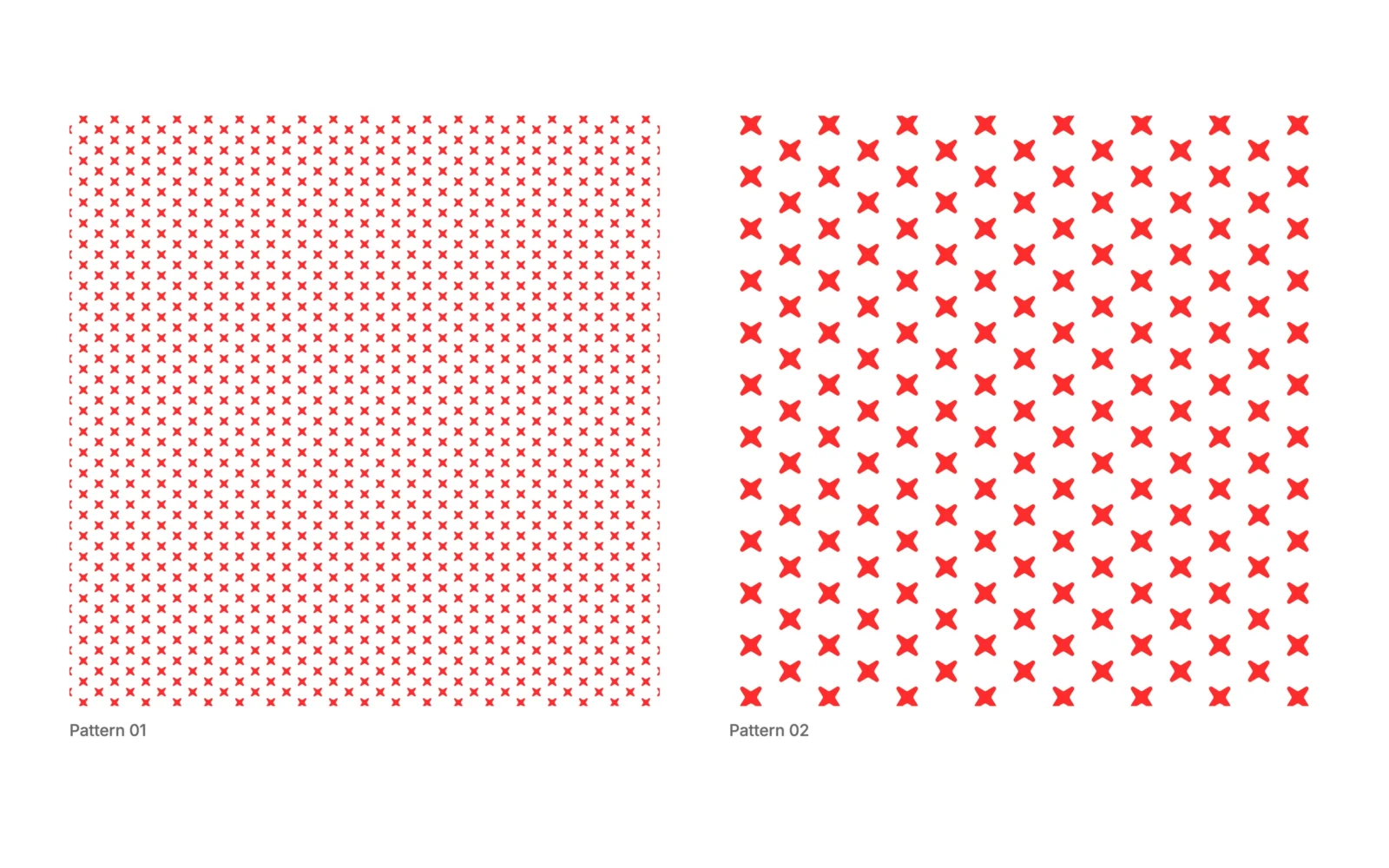
One small cross, repeated until it becomes the brand.

The cross from the logo, repeated, gives Nothing To Eat a texture people recognise before they read a word. Red on white on the bag and the box, white on red on the cups. Fine and dense, or large and bold: two scales, one signature.

Two square fields of red crosses on white: a fine, dense one labelled "Pattern 01" and an open one with larger crosses labelled "Pattern 02".

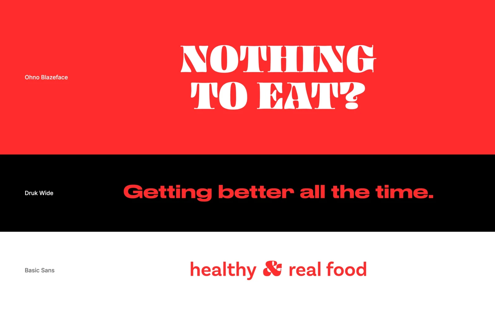
Three colours. Three voices.

Red to get noticed, white to breathe, black to sign off.

  • Red

    #FF2C2C: the brand’s appetite. The question, the cups, the screen.

  • White

    The ground of the bag, the box and the menu.

  • Black

    For the wordmark and the menu headings.

  • Ohno Blazeface

    The loud one, for the name, the question and the headlines.

  • Druk Wide

    Wide and bold, for the short line beside a title.

  • Basic Sans

    Plain and friendly, for everything you read.

Three bands: red with white lettering "NOTHING TO EAT?", black with red lettering "Getting better all the time.", white with red lettering "healthy & real food".

Packaging that does the talking.

The logo and a field of crosses. That is all it takes.

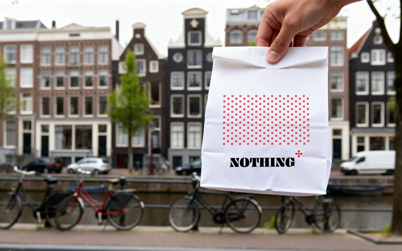
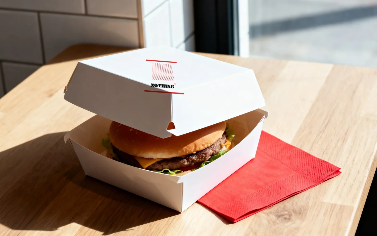
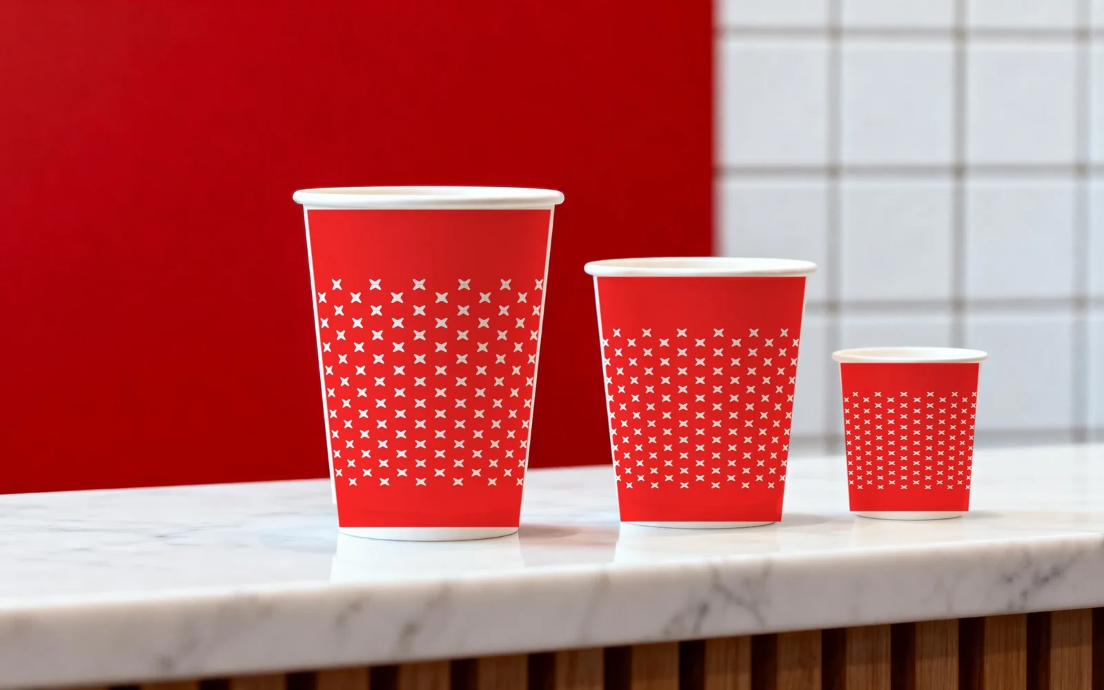
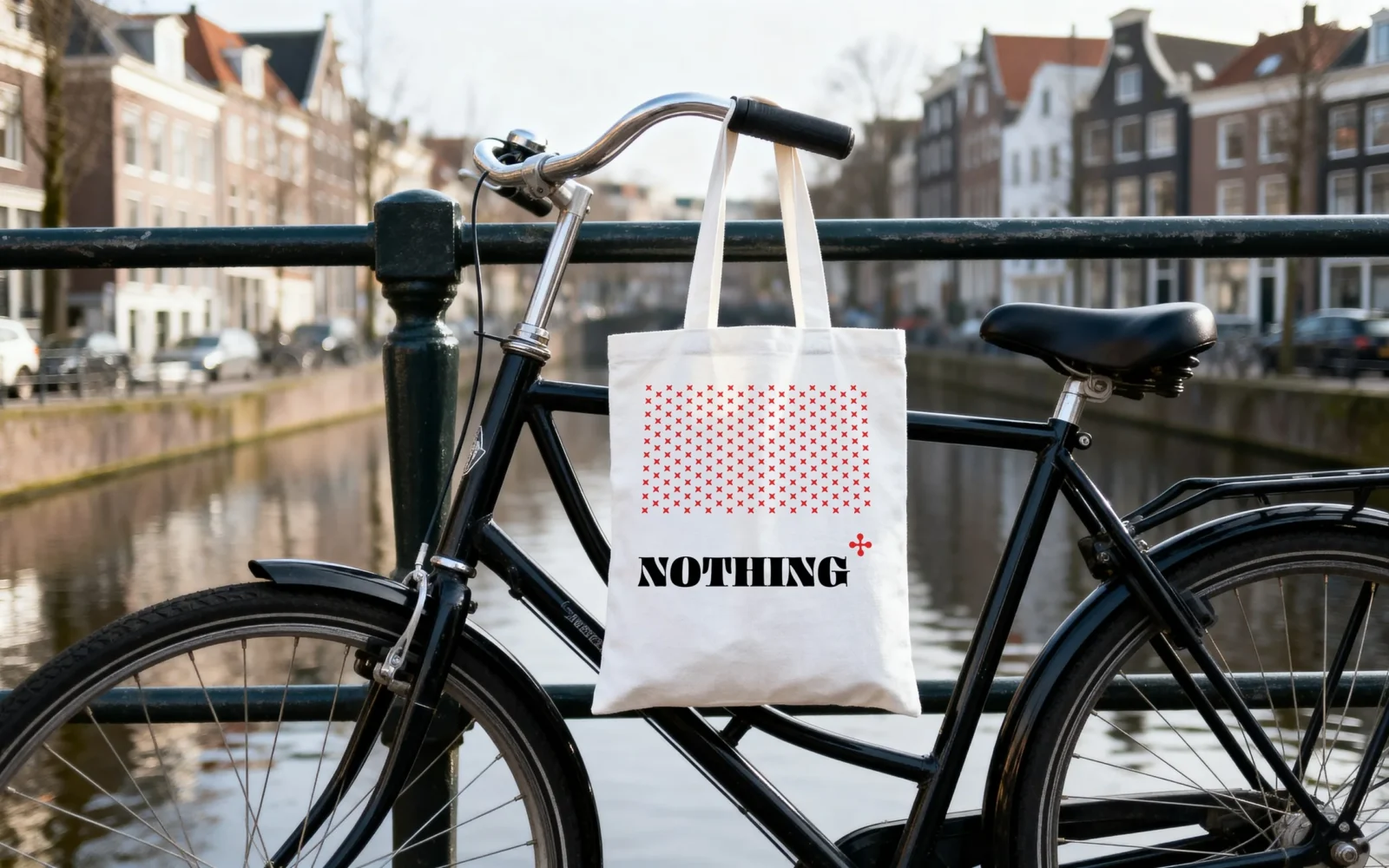
The bag, the burger box, the cups, the tote: each one is the logo and the pattern, nothing more, and each one is unmistakably Nothing To Eat. The box carries the crosses on every side, so it still looks the part when it is half eaten on a park bench. The cups turn the colours round, white on red.

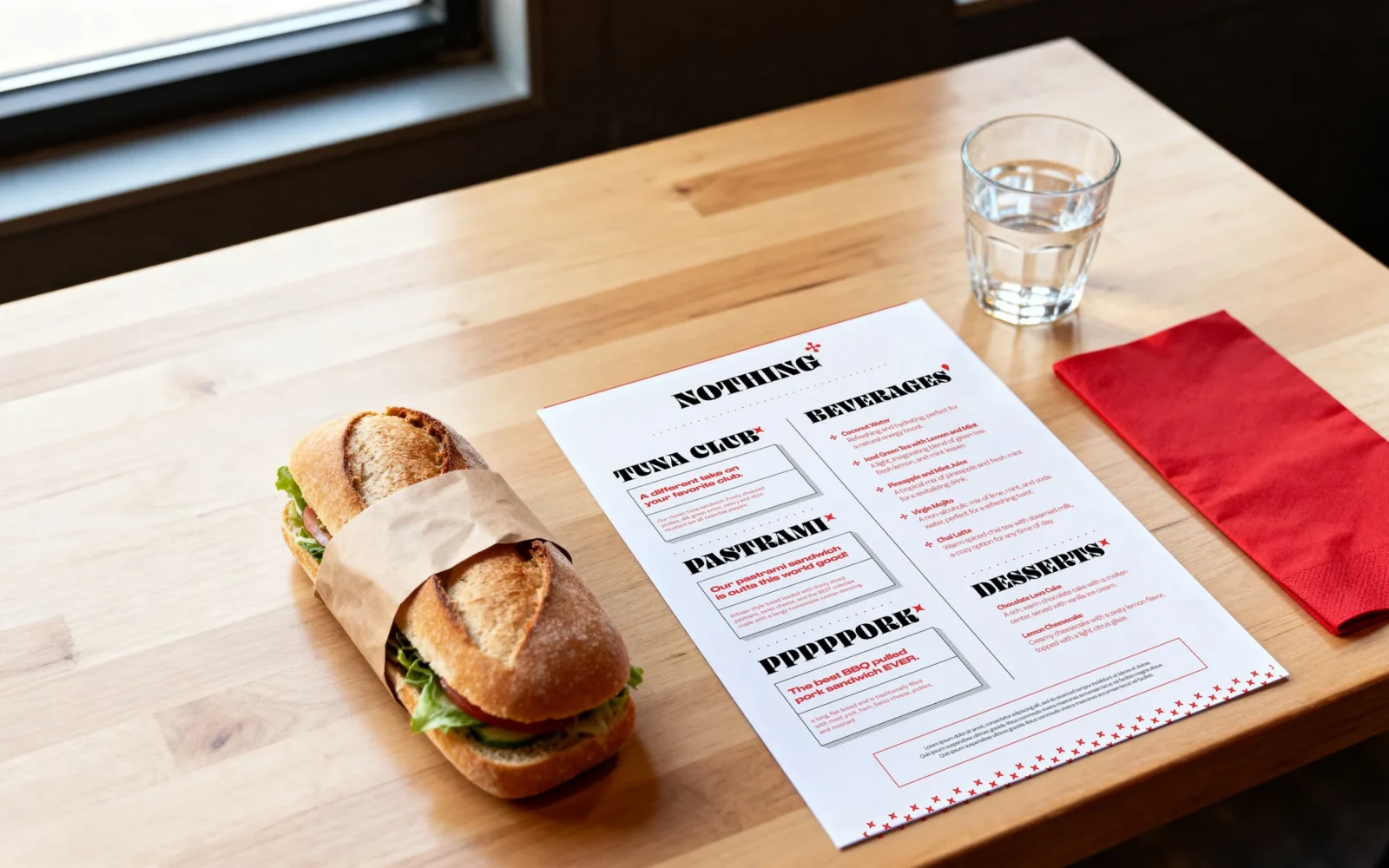
The menu keeps the same calm order: sandwiches on the left, drinks on the right, every sandwich on a card of its own, every heading with the small red mark.

A white paper bag with a field of red crosses and the "NOTHING" logo, held up on a canal street.
A white burger box open on a wooden table with a red napkin, the lid carrying a band of red crosses and the logo.
Three red cups of different sizes, wrapped in white crosses, on a marble counter.
The printed menu on a wooden table beside a wrapped sandwich, a glass of water and a red napkin.
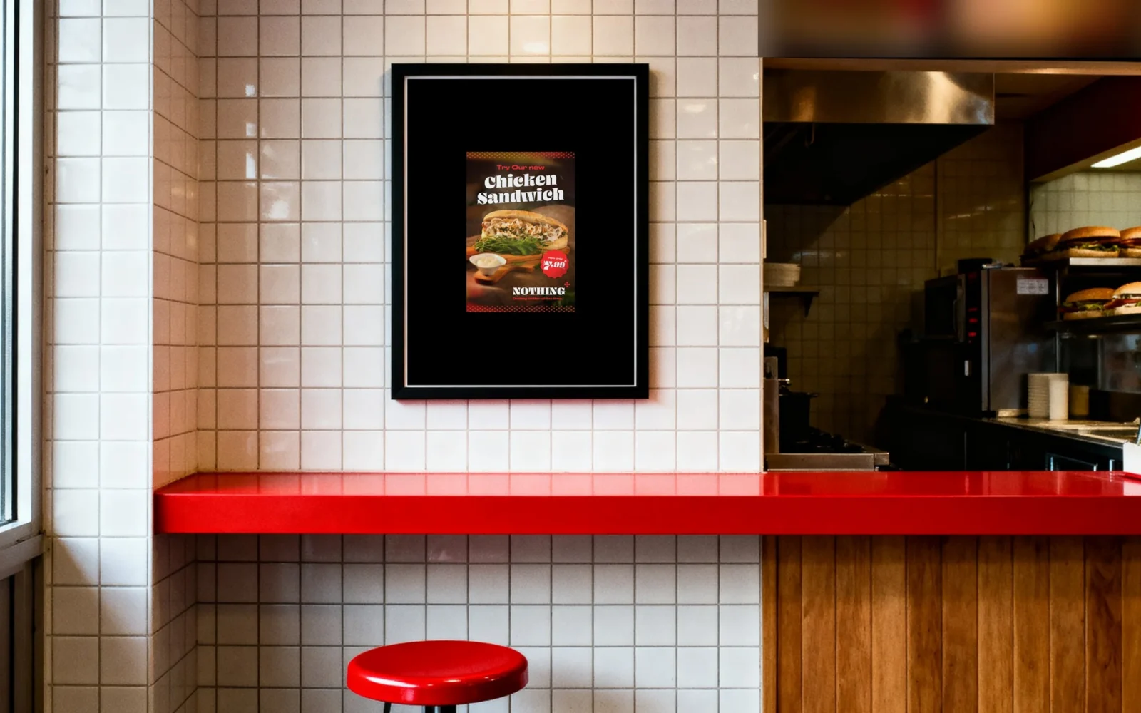
The Chicken Sandwich poster framed in black on a white tiled wall above a red counter.
A white tote with a field of red crosses and the logo hanging from a black bicycle by a canal.
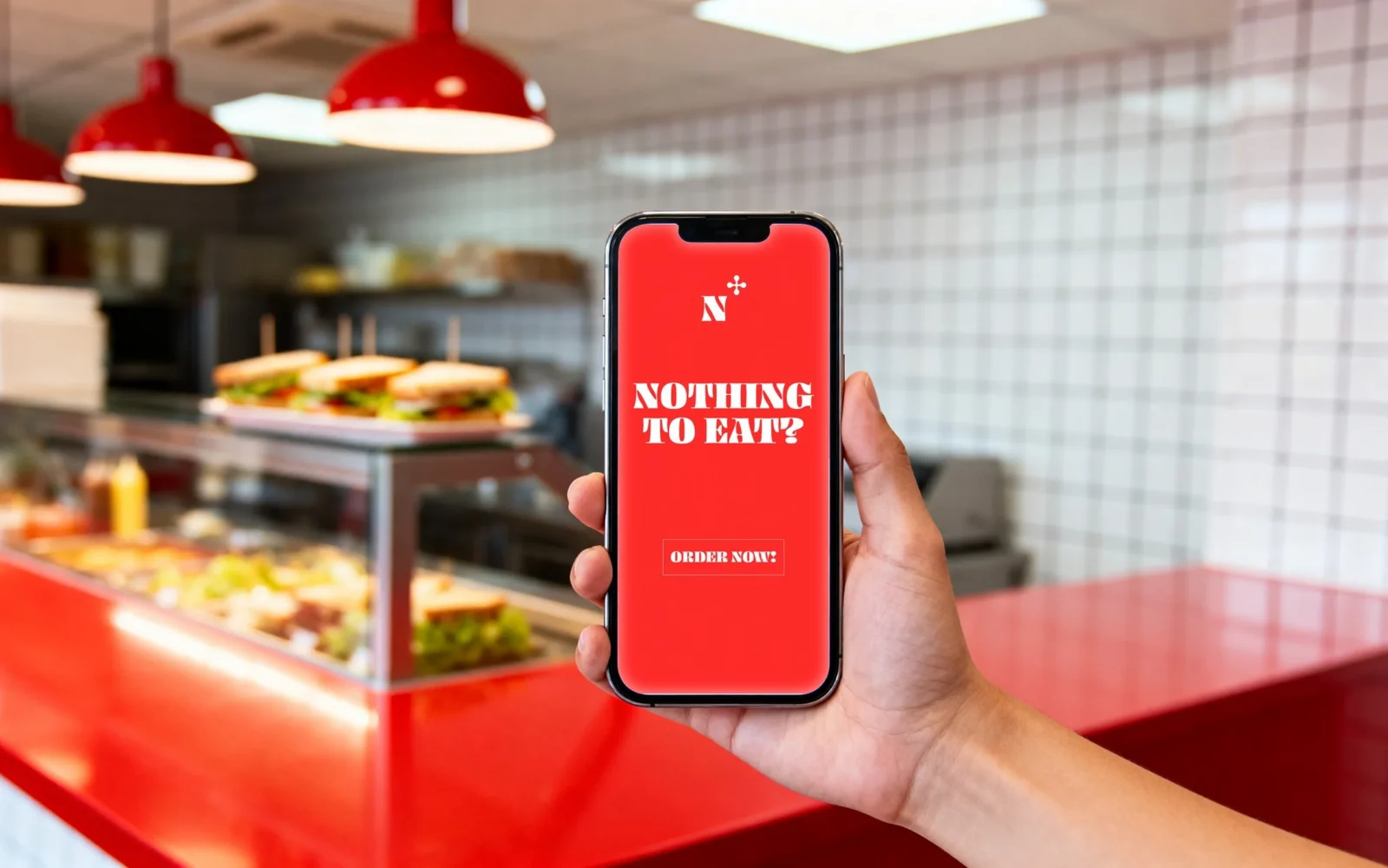
A hand holds a phone in the shop; the red screen reads "NOTHING TO EAT?" with a button "ORDER NOW!".

A website that reads like the menu.

Open it hungry, close it ordering.

The site borrows its order from the printed menu, not from a template. The question greets you, a sandwich stands beside it and one button takes you straight to the food. Then the sandwiches, one by one, each with its picture and one red line that sells it. A short chapter on where the food comes from. And a closing like the back of a menu card: where to find the shop, a drawn map of Amsterdam, and the question one last time, as large as the screen allows.

  • The welcome: “NOTHING TO EAT?”, a sandwich and “ORDER NOW!”.
  • The menu: three signature sandwiches, then drinks and desserts.
  • Local: the bread, the vegetables and the neighbours behind them.
  • The footer: the house, the map, the question.
  • On a phone: the same menu in one column, made for a thumb.
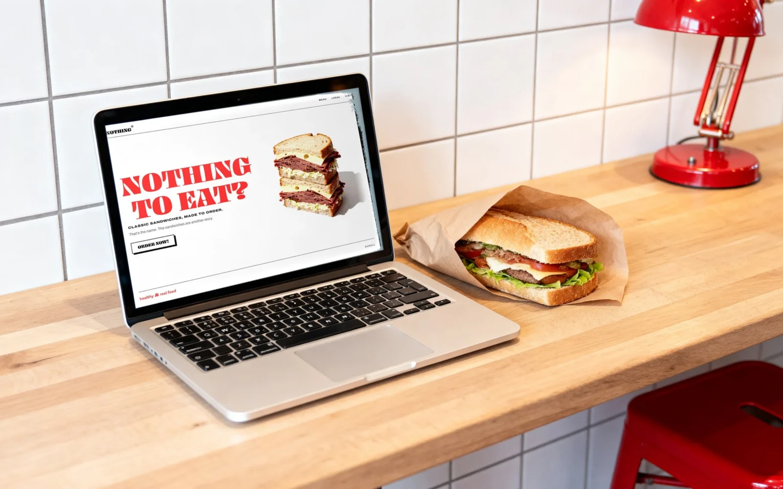
A laptop on a wooden counter against white tiles, a red lamp above and a wrapped sandwich beside it; the screen shows the first screen of the Nothing To Eat website with the red lettering "NOTHING TO EAT?".
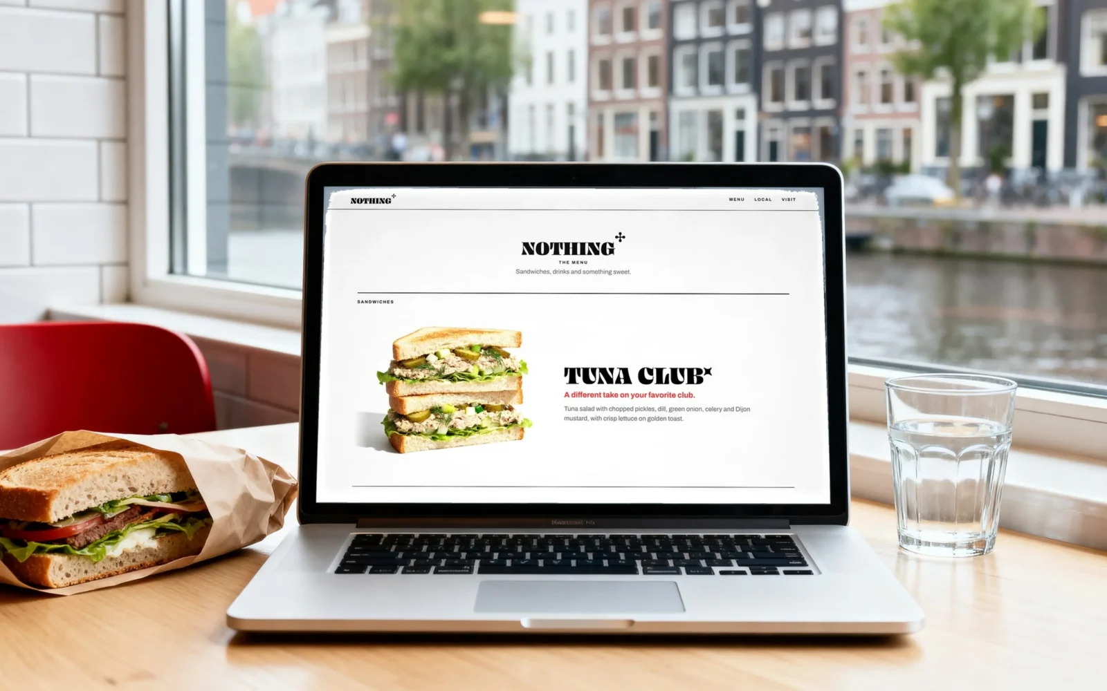
A laptop on a table at a window over an Amsterdam canal, a sandwich and a glass of water beside it; the screen shows the menu of the Nothing To Eat website with the Tuna Club.
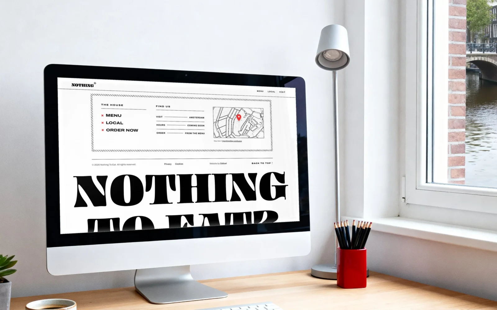
A desktop screen in a bright studio by a canal; it shows the footer of the Nothing To Eat website: the house links, a drawn map of the canals with a red pin, and “NOTHING TO EAT?” set very large.
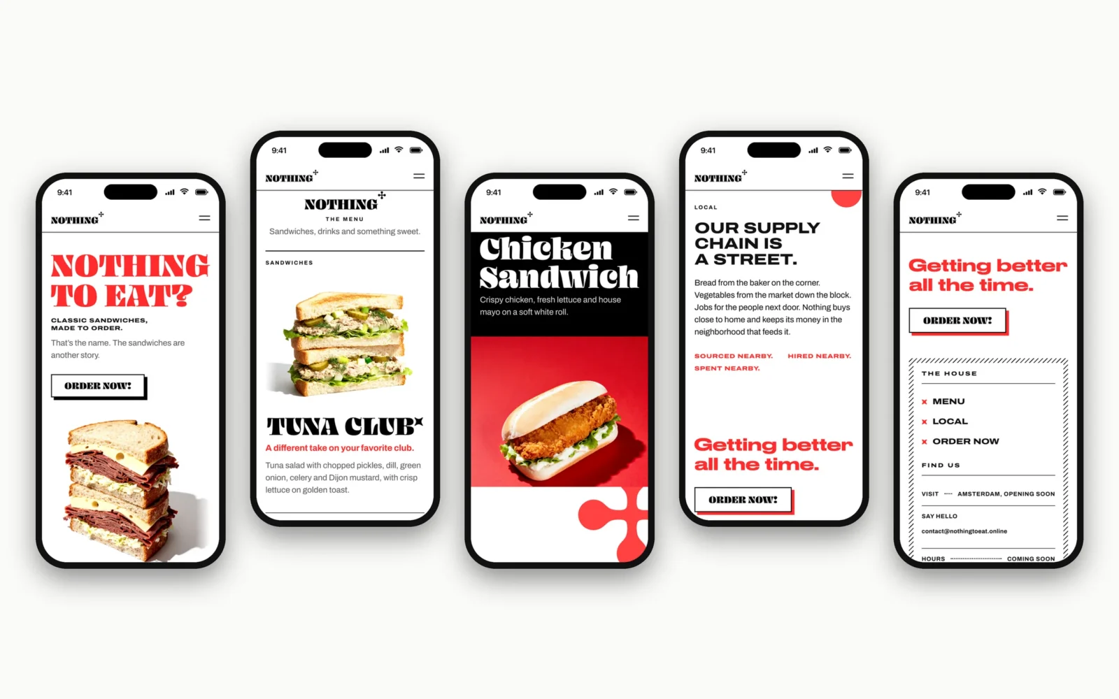
Five phones in a row on a light ground, each showing a part of the Nothing To Eat website: the welcome, the menu with the Tuna Club, the Chicken Sandwich, the Local section and the footer with “Getting better all the time.”
A hand holds a phone over the cobbles of a canal street; the screen shows the black and red band of the Chicken Sandwich.
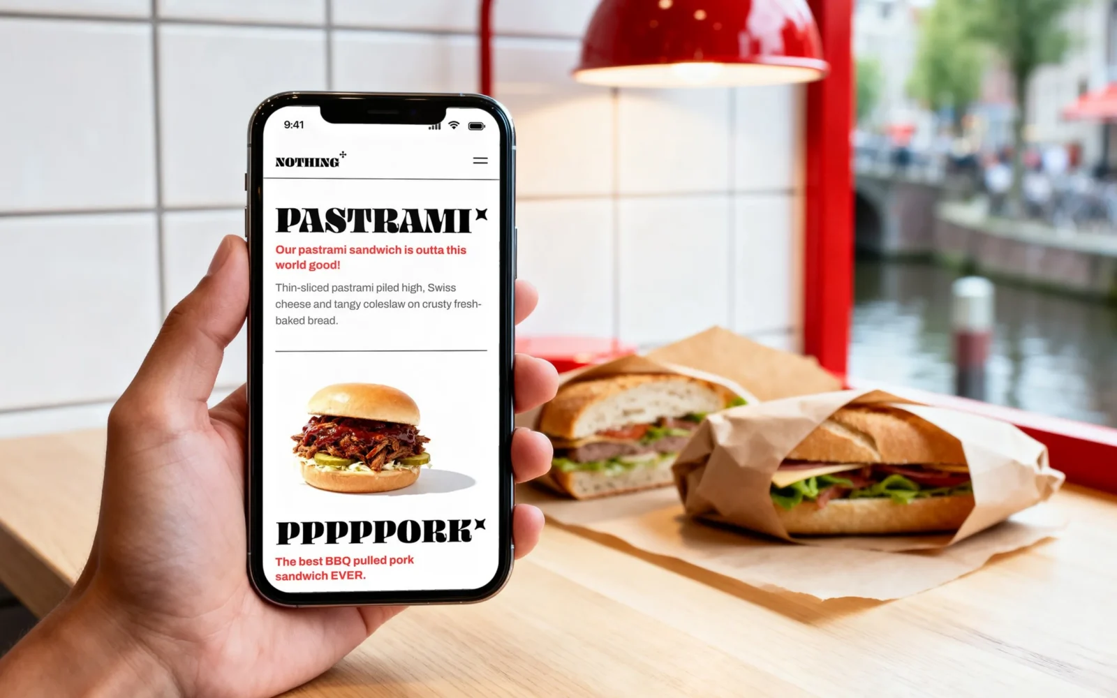
A hand holds a phone over a counter with wrapped sandwiches; the screen shows the Pastrami and the Pppppork of the Nothing To Eat menu.
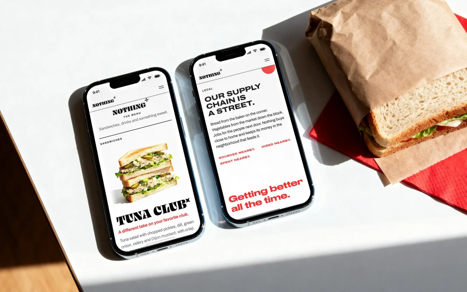
Two phones lie on a white table beside a wrapped sandwich and a red napkin; one shows the menu with the Tuna Club, the other the section "OUR SUPPLY CHAIN IS A STREET."

Just enough movement.

Calm, quick and always about the food.

The website feels alive without ever getting in the way: the question greets you, the sandwiches arrive as you scroll, and the page is ready before you have decided what to order.

Easy to run, every day.

The brand doesn’t stop at the front door. It runs the back office too.

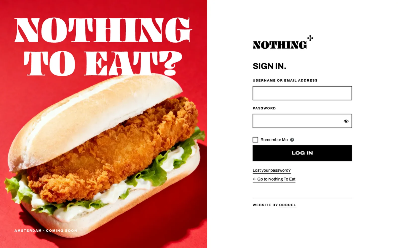
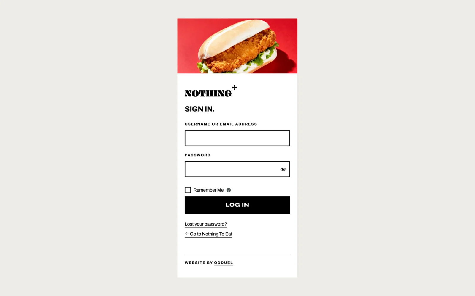
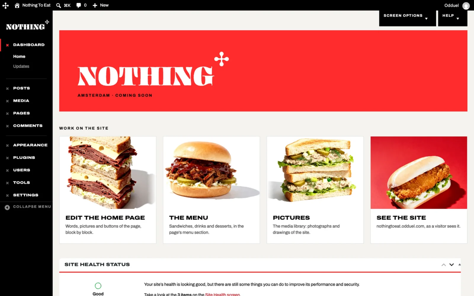
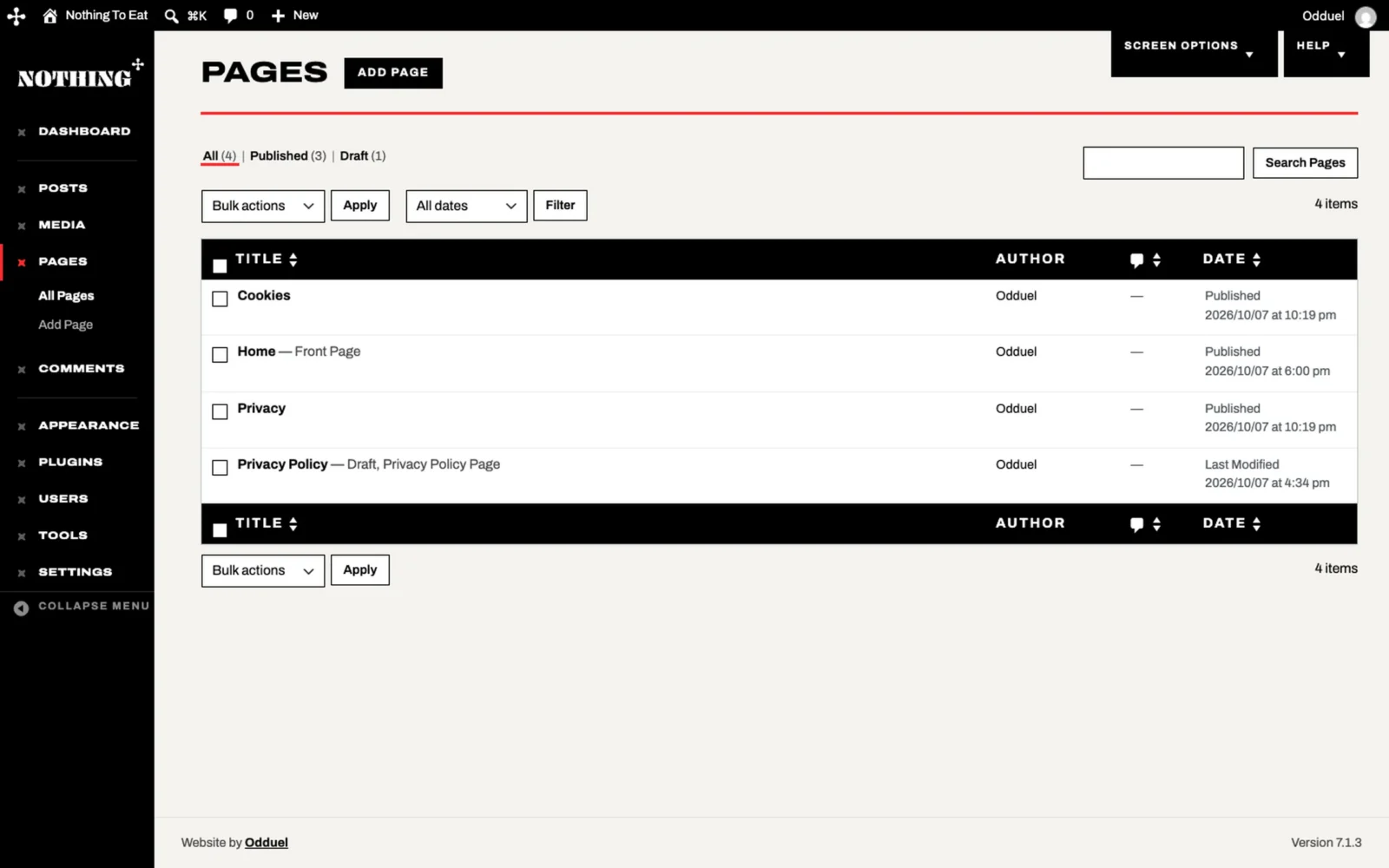
The website is developed in WordPress, with a custom dashboard in the Nothing To Eat identity. From the sign-in to the menu, the team behind the counter can change a sandwich, a price line or a photograph in a few minutes, and see it exactly as customers will. Easy to manage, easy to update, and theirs.

The sign-in page of the Nothing To Eat admin back office in two halves: the red lettering “NOTHING TO EAT?” over a chicken sandwich; on white, the wordmark, “SIGN IN.”, the fields and a black “LOG IN” button.
The admin sign-in at phone width: a chicken sandwich on red, then the wordmark, “SIGN IN.” and the fields.
The Nothing To Eat dashboard: a black side menu under the wordmark, a red banner “Amsterdam · Coming soon”, then four picture cards: home page, menu, pictures, see the site.
The page list in the admin back office: “PAGES” in heavy capitals over a red rule, a table with black header bars.
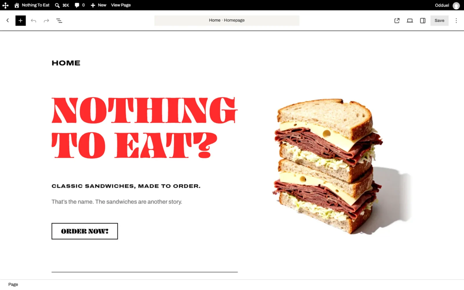
Editing the home page in the admin back office, shown as customers see it: “NOTHING TO EAT?”, “ORDER NOW!” and a pastrami sandwich.

Delivered

The logo in five versions, the pattern, the colours and type, the bag, the box, the cups and the menu, a website and its admin back office, all speaking with one voice.

Nothing To Eat brings together two of our services, branding and website development, from the paper bag to the phone screen. If your brand deserves the same appetite, tell us about it.

View the live site

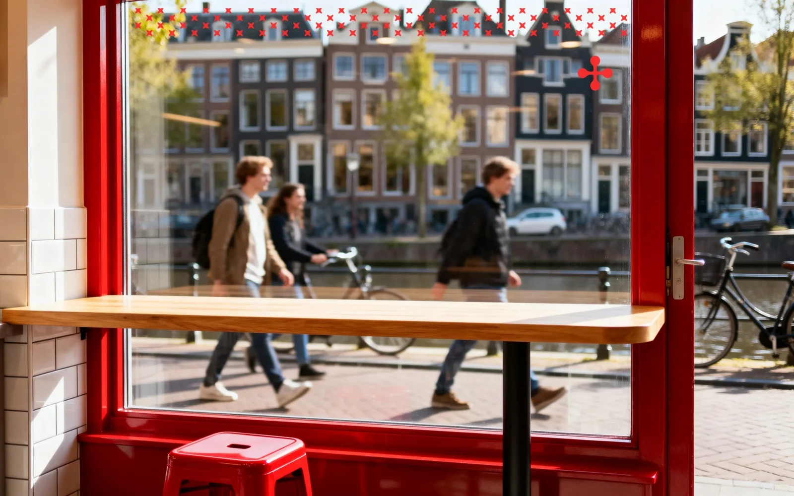
From inside, a window on a canal street: a red band of the pattern and the mark on the glass, people walking past.

Get in touch

Odds do not change on their own. If you have something to build, launch or fix, tell us about it and we will show you how we would approach it.

Let’s change your odds.

    Need an NDA before you share details? Start a project