Web typography is the choice and setting of type on a website: which typefaces, at what sizes, line lengths, line spacing, weights and contrast, and how the fonts are loaded so pages stay fast. Good web typography makes text easy to read on every screen, carries the brand’s voice and is accessible; a sensible system usually needs no more than two typefaces and a short scale of sizes.
Last updated: 29 October 2026.
This guide covers how to choose typefaces for a site, how to build a type scale, the settings that decide readability, accessibility requirements, font loading and performance, licensing, multilingual type and the mistakes we see most often. It is written for marketing leads, founders and designers briefing or reviewing a website.
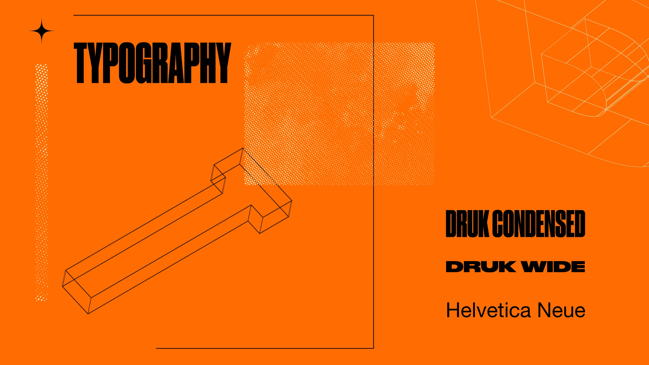
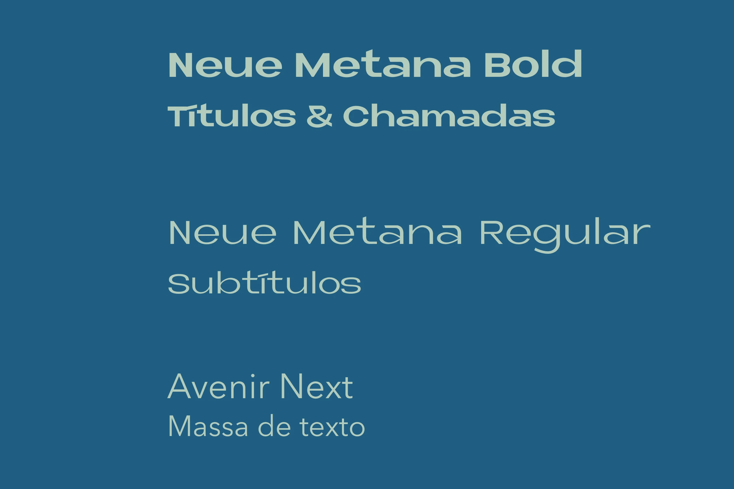
At Odduel, a creative and technology agency in Barcelona and São Paulo, our branding service designs identities whose type has to work on screens as well as on paper. For The Sugar Coated Cult we paired Druk Condensed and Druk Wide for display with Helvetica Neue for text; for Torto Cozinha, Neue Metana for titles with Avenir Next for body copy. Our own site is set in a self-hosted Inter. The principles below come from that work.
In short: choose one typeface for text that reads well at small sizes on screens, and at most one more for headings that carries the brand. Set body text at 16 pixels or larger, lines of roughly 45 to 75 characters and line spacing around 1.4 to 1.6 times the size. Build a short size scale, keep strong contrast, let text resize, load only the weights you use, self-host where the licence allows, and check every language you publish in.
How do you choose typefaces for a website?
Start with the job each typeface does, not with a mood board.
- Text face: the one that carries paragraphs, forms and menus. It needs open shapes, clear distinction between similar letters such as I, l and 1, a generous x-height for small sizes, and the weights and italics you need.
- Display face: optional, for headings and short statements where the brand speaks loudest. It can be more distinctive, because it is read in short bursts at large sizes.
- Monospace or accent face: occasional, for code, data or a specific brand device.
Test candidates with your real content, in every language you publish, at the sizes you will use, on a phone and a laptop. A face that looks striking in a specimen may tire the eye in a long paragraph.
The display face is where typography and identity meet. It should come from the brand’s own system, so that the website, packaging, social posts and signage feel like one voice. If the identity’s display face is not licensed for the web or does not cover your languages, choose a web-ready face with a similar structure rather than an unrelated substitute, and record the decision in the brand guidelines. Our branding guide explains how type fits into the wider identity, from the logo to the tone of voice.
Serif or sans serif on screens?
Modern screens render both well. Sans serif faces remain the common default for interfaces and body text because they stay clear at small sizes and on lower-resolution displays. Serif faces can work beautifully for long reading, editorial sites and brands that want a more literary voice, provided they are designed for screens and set at a comfortable size. The choice is about tone and legibility at your sizes, not a rule.
How do you build a type scale?
A type scale is a small set of sizes used consistently across the site. It keeps pages coherent and makes design and development faster.
| Role | Typical size on desktop | Typical size on phone | Line spacing | Notes |
|---|---|---|---|---|
| Body text | 16 to 20 px | 16 to 18 px | 1.4 to 1.6 | Never below 16 px for paragraphs |
| Small text (captions, labels) | 13 to 14 px | 13 to 14 px | 1.3 to 1.5 | Short texts only, with strong contrast |
| H3 | 20 to 24 px | 18 to 22 px | 1.2 to 1.35 | Clearly larger or bolder than body |
| H2 | 28 to 40 px | 24 to 30 px | 1.1 to 1.25 | Main section headings |
| H1 | 40 to 80 px or more | 30 to 44 px | 1.0 to 1.15 | One per page; may use the display face |
These are ranges, not a standard. Many sites now use fluid sizes that grow smoothly between a minimum and a maximum as the window widens, so headings fit narrow phones and still have presence on large screens.
Which settings decide readability?
- Line length: about 45 to 75 characters per line for body text, including spaces. Longer lines make it hard to find the next line; shorter ones break the rhythm.
- Line spacing: around 1.4 to 1.6 times the font size for paragraphs, tighter for large headings.
- Paragraph spacing: clear space between paragraphs, usually close to one line.
- Alignment: left-aligned text for most content in left-to-right languages; avoid justified text on the web, which creates uneven gaps.
- Weights: regular for body, a clearly heavier weight for emphasis and headings; very light weights are hard to read at small sizes.
- Capitals and spacing: short labels in capitals benefit from slightly wider letter spacing; long passages in capitals are hard to read.
- Widows and breaks: avoid single words alone on the last line of headings and short paragraphs; modern CSS can balance heading lines automatically.
How does typography affect accessibility?
Accessible typography is mostly good typography applied consistently. The Web Content Accessibility Guidelines set a minimum contrast ratio of 4.5:1 for normal text and 3:1 for large text, and expect that text can be resized and spacing increased without content being lost.
- Contrast: check text against its real background, including text over photographs.
- Resizing: use relative units so text grows when visitors increase the size in their browser.
- Spacing: layouts should survive increased line, letter and word spacing.
- No text in images: headings and messages should be real text that can be read, translated and resized.
- Clear focus and links: links should look like links, and keyboard focus should be visible.
Our guide to website accessibility covers the requirements that apply in Europe in more detail.
How does font loading affect performance?
Fonts are files that every visitor downloads, so they affect speed and how the page appears as it loads.
- Load only what you use: each weight and style is a separate file; two families in three weights each is usually plenty.
- Use modern formats: WOFF2 is compressed and supported by current browsers.
- Self-host where possible: serving fonts from your own domain avoids extra connections and, for some services, transfers of visitors’ data to third parties, which matters under the GDPR.
- Control how text appears: set font-display so text shows in a fallback font straight away, and choose a fallback with similar proportions so lines do not jump when the web font arrives.
- Preload the key file used for the first screen, and subset fonts to the characters your languages need.
- Consider variable fonts, which hold many weights in one file, when you use several weights.
Google’s font best practices explain these techniques in detail.
How does font licensing work on the web?
Fonts are software with licences. A desktop licence for designing print materials does not usually cover embedding the font on a website, and web licences may be priced by monthly page views or domains. Open-source families can be used freely within their licence terms. Keep a record of each font, its licence and what it covers, and include it in your brand guidelines; our guide to brand guidelines explains what else belongs there.
What changes on multilingual sites?
A site published in several languages needs type that covers every character it will show: accents in French, Portuguese and Spanish, the German ß and umlauts, and any other scripts you plan to add. Check the typeface’s character set before you commit, test headings in the longest language, because German and Portuguese words can be much longer than English ones, and make sure line breaks and hyphenation work in each language. Sizes that fit an English heading on one line may need to adapt for other languages.
What are the common web typography mistakes?
- Too many typefaces or weights, which look inconsistent and slow pages down.
- Body text too small, especially on phones.
- Low-contrast grey text on light backgrounds.
- Very long lines on wide screens.
- Text set in images, which cannot be read by screen readers, translated or resized.
- Fonts loaded from several services without need, adding connections and data transfers.
- Ignoring other languages, with missing accents or headings that overflow.
- No fallback plan, so text is invisible or jumps while fonts load.
Questions people ask
What is web typography?
Web typography is the choice and setting of type on websites: the typefaces, sizes, line lengths, line spacing, weights, contrast and the way fonts are loaded. It decides how easy text is to read on phones and computers, how the brand’s voice comes across and whether the site is accessible and fast.
What is the best font size for body text on a website?
For most websites, body text should be at least 16 pixels, and often 17 to 20 pixels on desktop for comfortable reading. Smaller sizes suit only short captions and labels. Line spacing of about 1.4 to 1.6 times the size and lines of 45 to 75 characters matter as much as the size itself for readability.
How many fonts should a website use?
Usually one or two typefaces: one for body text that reads well at small sizes, and optionally a second for headings that expresses the brand. Within those, load only the weights you actually use. More typefaces rarely improve a design, make pages look less consistent and add files that every visitor has to download.
Should I self-host web fonts?
Self-hosting is often the better choice when the licence allows it. Fonts served from your own domain avoid extra connections to third-party servers, give you control over caching and loading, and avoid sending visitors’ data to an external service, which matters for GDPR compliance in Europe. Check your font licence first, because some only allow serving from the foundry.
How does typography affect accessibility?
Typography affects whether people with low vision, dyslexia or older devices can read your content. Accessible typography uses sufficient contrast, readable sizes, real text rather than images, units that let text resize, layouts that survive extra spacing, and clearly visible links and focus. These requirements come from the Web Content Accessibility Guidelines and European accessibility rules.
Good web typography is a short, consistent system tested with real content in every language you publish. See how our branding service designs type that works on screen and in print, or tell us about your project and we will review the typography of your site.